Chapter 4 Hierarchical Models with Stan
4.1 Motivation: The Problem with Simple Models
In many social science and public health applications, data are collected from multiple groups, contexts, or units. Consider a study on teaching methods across different schools, crime rates across neighborhoods, or patient outcomes across different hospitals. If we analyze each group separately, we ignore the commonalities between them, leading to potentially noisy and inefficient estimates for small groups.
Conversely, if we pool all the data and run a single, simple model (e.g., a simple linear regression), we ignore the important heterogeneity (differences) between groups. This is often referred to as the “no pooling” vs. “complete pooling” dilemma.
A simple model assumes:
- No Pooling (Separate Models): That each group is entirely unique and shares no information with others.
- Complete Pooling (Single Model): That all groups are identical and can be treated as one.
Neither approach fully reflects reality. Groups are typically related but not identical. This is where hierarchical (or multilevel) models provide a powerful, flexible solution.
4.1.1 Why Use Hierarchical Models?
Hierarchical models, a natural fit for Bayesian analysis, offer a framework to simultaneously model both group-level effects and overall population trends. They allow for partial pooling, a compromise between the two extremes:
- Borrowing Strength: Estimates for a particular group are informed by the data from that group and the data from all other groups. This is especially beneficial for groups with few observations, whose estimates become more stable and less prone to extreme values.
- Modeling Variation: We can explicitly model how parameters (like means or slopes) vary across different groups, providing insight into the sources of heterogeneity.
This makes hierarchical models essential for analyzing nested or clustered data structures, such as students within classrooms, repeated measures within individuals, or, as we saw with spatial modelling, observations within geographic regions.
4.1.2 Introducing Stan: A Powerful Tool for Bayesian Inference
Traditional methods for fitting complex Bayesian models, such as those relying on Markov Chain Monte Carlo (MCMC) sampling, can be notoriously slow, particularly for models with many parameters or complex structure, a problem that is exacerbated by large datasets.
Stan is a state-of-the-art platform for statistical modeling and high-performance statistical computation. It is named in honor of statistician Stanislaw Ulam.
| Feature | Description |
|---|---|
| Why it’s Powerful | Stan uses Hamiltonian Monte Carlo (HMC) and its variant, the No-U-Turn Sampler (NUTS), which are far more efficient than older MCMC algorithms like Gibbs sampling. This allows for the fitting of highly complex, high-dimensional models in a fraction of the time. |
| Model Specification | Models are specified in the Stan language, a declarative language that separates the statistical model from the data and the sampling algorithm. |
| Integration | While its models are written in the Stan language, the platform is easily accessible through popular interfaces like rstan (for R) and PyStan (for Python), making it a versatile tool for data scientists and statisticians. |
In short, Stan provides the computational muscle to implement the complex, flexible models that Bayesian statistics are designed for, making sophisticated methods like hierarchical modeling practical for real-world data analysis.
4.2 Defining Hierarchical Models
A hierarchical model is a statistical model where parameters of the model have prior distributions that are themselves governed by other parameters, known as hyperparameters.
Imagine a set of \(J\) groups, and we are interested in estimating a parameter \(\theta_j\) for each group \(j\). The structure is as follows:
- Data Level (Likelihood): The observed data \(Y_j\) in group \(j\) is modeled based on the group-specific parameter \(\theta_j\) and potentially other covariates \(\mathbf{x}_j\). \[ Y_j \sim \text{Likelihood}(\theta_j, \mathbf{x}_j) \]
- Parameter Level (Prior): Instead of assigning a fixed prior to each \(\theta_j\) independently, we assume all group parameters \(\theta_j\) are drawn from a common distribution, which is controlled by a set of hyperparameters \(\boldsymbol{\psi}\). \[ \theta_j \sim \text{Common Distribution}(\boldsymbol{\psi}) \]
- Hyperparameter Level (Hyperprior): The hyperparameters \(\boldsymbol{\psi}\) are then given a final, simple prior distribution (often a vague prior or hyperprior) to complete the Bayesian structure. \[ \boldsymbol{\psi} \sim \text{Hyperprior}(\phi) \]
where \(\phi\) are your hyperparameters. This structure formalizes the concept of partial pooling: the estimate for any single \(\theta_j\) is pulled toward the population mean defined by \(\boldsymbol{\psi}\), with the degree of pooling depending on the amount of data available in group \(j\). This balancing act leads to more accurate and less volatile estimates for all groups.
Let \(f(\textbf{y} \mid \boldsymbol{\theta})\) denote the likelihood of the observed data given the group-specific parameters, \(\pi(\boldsymbol{\theta} \mid \boldsymbol{\psi})\) denote the prior distribution of the group-specific parameters given the hyperparameters, and \(\pi(\boldsymbol{\psi})\) denote the hyperprior distribution of the hyperparameters. The joint posterior distribution of all parameters given the data can be expressed using Bayes’ theorem as:
\[ \pi(\boldsymbol{\theta}, \boldsymbol{\psi} \mid \textbf{y}) \propto f(\textbf{y} \mid \boldsymbol{\theta}) \pi(\boldsymbol{\theta} \mid \boldsymbol{\psi}) \pi(\boldsymbol{\psi}) \]
4.3 The High School and Beyond (HSB) Dataset
We will use the classic “High School and Beyond” dataset. This dataset is included in the mlmRev package but can also be found in the iprior package.
- Dataset:
Hsb82 - Observations: 7,185 students
- Groups: 160 schools
- Variables:
mathach: The outcome variable. A measure of math achievement.ses: The predictor variable. A continuous measure of socio-economic status.school: The grouping variable. A categorical ID for the 160 schools.
This dataset is ideal for demonstrating hierarchical modeling because it has a clear nested structure: students are nested within schools. We expect that students within the same school might be more similar to each other than to students in other schools, and schools themselves may differ in their overall performance and in how socioeconomic status relates to achievement.
4.3.1 Setup and Exploratory Data Analysis (EDA)
First, let’s install and load the packages we’ll need.
# Run this once if you don't have these packages installed
install.packages(c("iprior", "tidyverse", "rstan", "loo", "bayesplot"))library(tidyverse) # General data manipulation and visualization
library(iprior) # HSB data set
library(rstan) # Stan interface for R
library(loo) # Leave-one-out cross-validation and model comparison
library(bayesplot) # Plotting for Bayesian models
options(mc.cores = parallel::detectCores())
rstan_options(auto_write = TRUE)4.3.2 Load and Inspect the Data
We load the Hsb82 dataset and prepare it for analysis. We’ll convert school IDs to integers for easier use in Stan, which requires integer indices for groups.
# Load the dataset
data(hsb)

# Tidy up the data: convert school IDs to integers 1..J
hsb_data <- hsb %>%
    mutate(schoolid = factor(as.integer(factor(schoolid))))

# Check the structure
str(hsb_data)
## 'data.frame': 7185 obs. of 3 variables:
## $ mathach : num 5.88 19.71 20.35 8.78 17.9 ...
## $ ses : num -1.528 -0.588 -0.528 -0.668 -0.158 ...
## $ schoolid: Factor w/ 160 levels "1","2","3","4",..: 1 1 1 1 1 1 1 1 1 1 ...## mathach ses schoolid
## Min. :-2.832 Min. :-3.7580000 22 : 67
## 1st Qu.: 7.275 1st Qu.:-0.5380000 81 : 66
## Median :13.131 Median : 0.0020000 66 : 65
## Mean :12.748 Mean : 0.0001434 52 : 64
## 3rd Qu.:18.317 3rd Qu.: 0.6020000 62 : 64
## Max. :24.993 Max. : 2.6920000 144 : 64
## (Other):6795# How many students per school?
school_counts <- hsb_data %>%
group_by(schoolid) %>%
summarize(n_students = n()) %>%
arrange(n_students)
# Summary of school sizes
summary(school_counts$n_students)## Min. 1st Qu. Median Mean 3rd Qu. Max.
## 14.00 35.00 47.00 44.91 54.00 67.00The summary statistics show us the distribution of our variables. Notice that the number of students per school varies considerably—this variation in group sizes is one reason hierarchical models are so valuable. Schools with few students will benefit from “borrowing strength” from the population.
4.3.3 Visualizing the Data
Let’s start by examining the overall relationship between SES and math achievement, ignoring the school structure.
ggplot(hsb_data, aes(x = ses, y = mathach)) +
  geom_point(alpha = 0.1) +
  geom_smooth(method = "lm", color = "blue", fill = "blue") +
  theme_bw() +
  labs(title = "Overall Relationship: Math Achievement vs. SES",
       x = "Socio-Economic Status",
       y = "Math Achievement")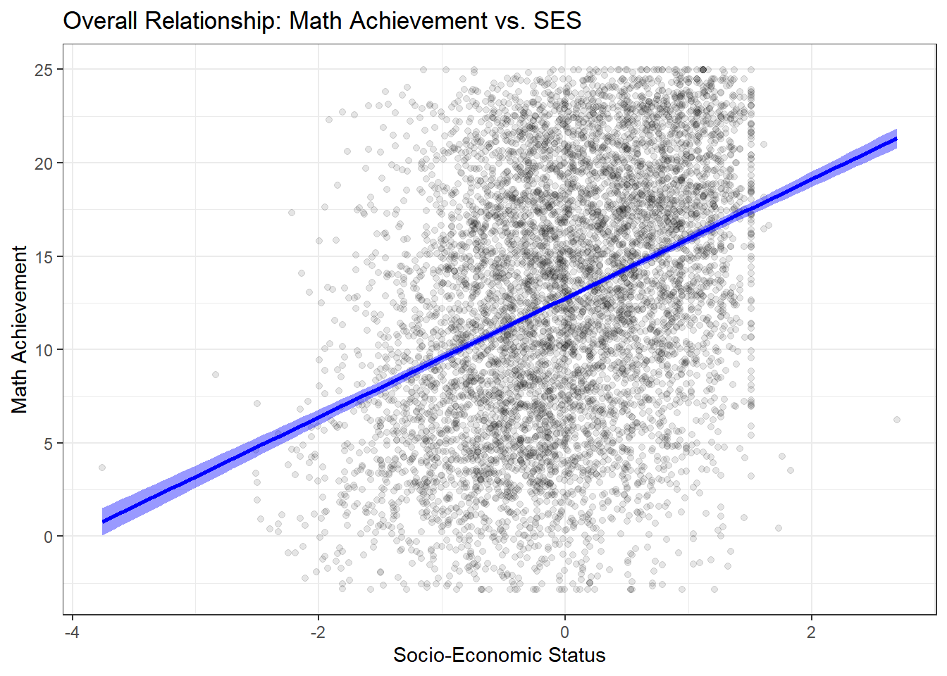
There is a clear, positive, and linear relationship: higher SES is associated with higher math achievement. The relationship appears fairly strong, but this aggregate view masks important heterogeneity.
But does this relationship hold true for all schools? This is the key hierarchical question. Let’s plot the data for a random sample of 12 schools to visualize the heterogeneity.
# Get a random sample of 12 school IDs
set.seed(123)
sample_schools <- sample(unique(hsb_data$schoolid), 12)

hsb_data %>%
  filter(schoolid %in% sample_schools) %>%
  ggplot(aes(x = ses, y = mathach, color = schoolid)) +
  geom_point(alpha = 0.5) +
  # Add a regression line for each school
  geom_smooth(method = "lm", se = FALSE) +
  # Facet by school
  facet_wrap(~ schoolid) +
  theme_bw() +
  # Remove the legend (it's redundant)
  theme(legend.position = "none") +
  labs(title = "Relationship of SES and Math Achievement in 12 Sample Schools",
       x = "SES",
       y = "Math Achievement")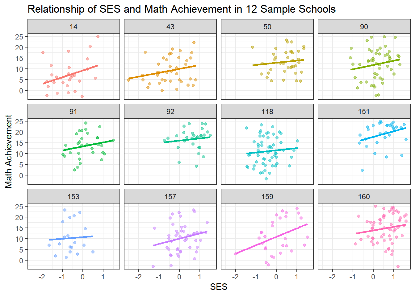
This plot is the key motivation for a hierarchical model. We can clearly see:
Varying Intercepts: Some schools have much higher average achievement than others (e.g., some schools consistently score higher), even after accounting for SES. This suggests school-level differences in quality, resources, or student composition.
Varying Slopes: The relationship between SES and achievement differs across schools. In some schools, the line is steep, suggesting a strong relationship between socioeconomic status and achievement. In others, it’s flatter, suggesting SES matters less for student outcomes. Some schools may have more equitable resources or teaching practices.
Different Sample Sizes: Notice that some schools have many data points while others have few. The regression lines for schools with few students are more uncertain and potentially more prone to overfitting.
These observations suggest we need a model that accounts for school-level variation while still learning from the overall population pattern.
4.4 The Three “Pooling” Approaches
When we have grouped data, we have three fundamental choices for how to model it. Each approach makes different assumptions about the relationship between groups.
4.4.1 1. Complete Pooling (No Hierarchy)
The Assumption: All schools are identical. There is no meaningful difference between schools—only one true intercept and slope exist for the entire population.
Pros:
- Simplest possible model
- Maximum statistical power (uses all data)
- Easy to interpret
Cons:
- Violates independence assumption (students within schools are likely correlated)
- Ignores potentially important school-level variation
- May lead to incorrect inferences and predictions
- Cannot answer questions about individual schools
When to use: Only when you truly believe groups are exchangeable and there’s no meaningful group structure, or when group differences are negligible.
4.4.2 2. No Pooling (Fixed Effects Model)
The Assumption: Every school is completely unique and independent. The relationship between SES and achievement in School A tells you nothing about School B.
Pros:
- Captures the unique behavior of each school
- No restrictive assumptions about similarity between schools
- Flexible—allows complete heterogeneity
Cons:
- Overfitting, especially for schools with few students
- Estimates for small schools will be noisy and unreliable
- Uses many parameters (160 schools × 2 parameters = 320 parameters!)
- Cannot make predictions for new schools not in the dataset
- Doesn’t learn about “schools in general”
When to use: When groups are truly independent, you have large sample sizes within each group, and you only care about the specific groups in your dataset.
4.4.3 3. Partial Pooling (Hierarchical Model)
The Assumption: Schools are related but not identical. Each school has its own parameters, but these parameters are drawn from a common population distribution. Schools share information through this common distribution.
Pros:
- Borrows strength across groups—improves estimates for all schools, especially small ones
- Balances between ignoring and overemphasizing group differences
- Provides estimates of population-level parameters
- Can make predictions for new schools
- Accounts for uncertainty at multiple levels
- Reduces overfitting through regularization
Cons:
- More complex to specify and fit
- Requires more computational resources
- Requires assumptions about the form of between-group variation
When to use: Almost always when you have grouped/nested data! This is the recommended approach for most real-world scenarios with hierarchical structure.
4.5 Model fitting
4.5.1 Model 1: Complete Pooling
Let’s start by fitting the simplest model that ignores school structure entirely. Let \(y_{ij}\) be the math achievement score for student \(i\) in school \(j\) where \(i=1,\ldots,n_j\) and \(j=1,\ldots,J\). Let \(\text{ses}_{ij}\) be the socio-economic status for student \(i\) in school \(j\).
4.5.2 Mathematical Specification
This is simple linear regression: \[ y_{ij} = \beta_0 + \beta_1 \cdot \text{ses}_{ij} + \epsilon_{ij} \]
where
- \(\beta_0\) : A single intercept for all schools
- \(\beta_1\) : A single slope for SES across all schools
- \(\epsilon_{ij} \sim N(0, \sigma^2)\) : Residual error
4.5.3 Frequentist Approach (for comparison)
First, let’s fit this using standard linear regression to establish a baseline.
# Fit the complete pooling model
complete_pooling_model <- lm(mathach ~ ses, data = hsb_data)
summary(complete_pooling_model)
##
## Call:
## lm(formula = mathach ~ ses, data = hsb_data)
##
## Residuals:
## Min 1Q Median 3Q Max
## -19.4382 -4.7580 0.2334 5.0649 15.9007
##
## Coefficients:
## Estimate Std. Error t value Pr(>|t|)
## (Intercept) 12.74740 0.07569 168.42 <2e-16 ***
## ses 3.18387 0.09712 32.78 <2e-16 ***
## ---
## Signif. codes: 0 '***' 0.001 '**' 0.01 '*' 0.05 '.' 0.1 ' ' 1
##
## Residual standard error: 6.416 on 7183 degrees of freedom
## Multiple R-squared: 0.1301, Adjusted R-squared: 0.13
## F-statistic: 1075 on 1 and 7183 DF, p-value: < 2.2e-16The output shows us that there’s a significant positive relationship between SES and math achievement (the slope is positive and significantly different from zero). However, this model assumes all students are independent, which we know is not true—students within the same school likely share characteristics.
4.5.4 Bayesian Approach with Stan
In a Bayesian framework, we must assign priors to all model parameters. We’ll use weakly informative priors:
\[ \beta_0 \sim N(0, 10) \\ \beta_1 \sim N(0, 10) \\ \sigma \sim \text{Cauchy}^+(0, 5) \]
where \(\text{Cauchy}^+\) denotes the half-Cauchy distribution (Cauchy truncated to positive values). These priors are relatively uninformative but help with computational stability.
hsb_complete_model <- "
data {
    int<lower=0> N;        // Number of observations
    vector[N] mathach;     // Math achievement scores
    vector[N] ses;         // Socio-economic status
}

parameters {
    real beta_0;           // Intercept
    real beta_1;           // Slope for ses
    real<lower=0> sigma;   // Residual standard deviation
}

model {
    // Priors
    beta_0 ~ normal(0, 10);
    beta_1 ~ normal(0, 10);
    sigma ~ cauchy(0, 5);

    // Likelihood
    mathach ~ normal(beta_0 + beta_1 * ses, sigma);
}

generated quantities {
    vector[N] log_lik;     // For model comparison
    vector[N] mathach_rep; // For posterior predictive checks

    for (n in 1:N) {
        log_lik[n] = normal_lpdf(mathach[n] | beta_0 + beta_1 * ses[n], sigma);
        mathach_rep[n] = normal_rng(beta_0 + beta_1 * ses[n], sigma);
    }
}
"

hsb_complete_data <- list(
    N = nrow(hsb_data),
    mathach = hsb_data$mathach,
    ses = hsb_data$ses
)

complete_pooling_fit <- stan(
    model_code = hsb_complete_model,
    data = hsb_complete_data,
    iter = 2000,
    chains = 4,
    seed = 123
)
The first part is the model code in Stan language, specifying the data, parameters, model, and generated quantities for posterior predictive checks and model comparison. Then we need to prepare the data as a list to pass into the stan function, exactly as defined in the model code. Finally, we call the stan function to fit the model, specifying the number of iterations, chains, and a random seed for reproducibility. In general it is a good idea to run multiple chains to assess convergence.
4.5.4.1 Diagnosing the Fit
After fitting a Bayesian model, we should always check diagnostics to ensure the MCMC chains have converged and are sampling properly.
# Trace plots show the MCMC chains over iterations
traceplot(complete_pooling_fit, pars = c("beta_0", "beta_1", "sigma"))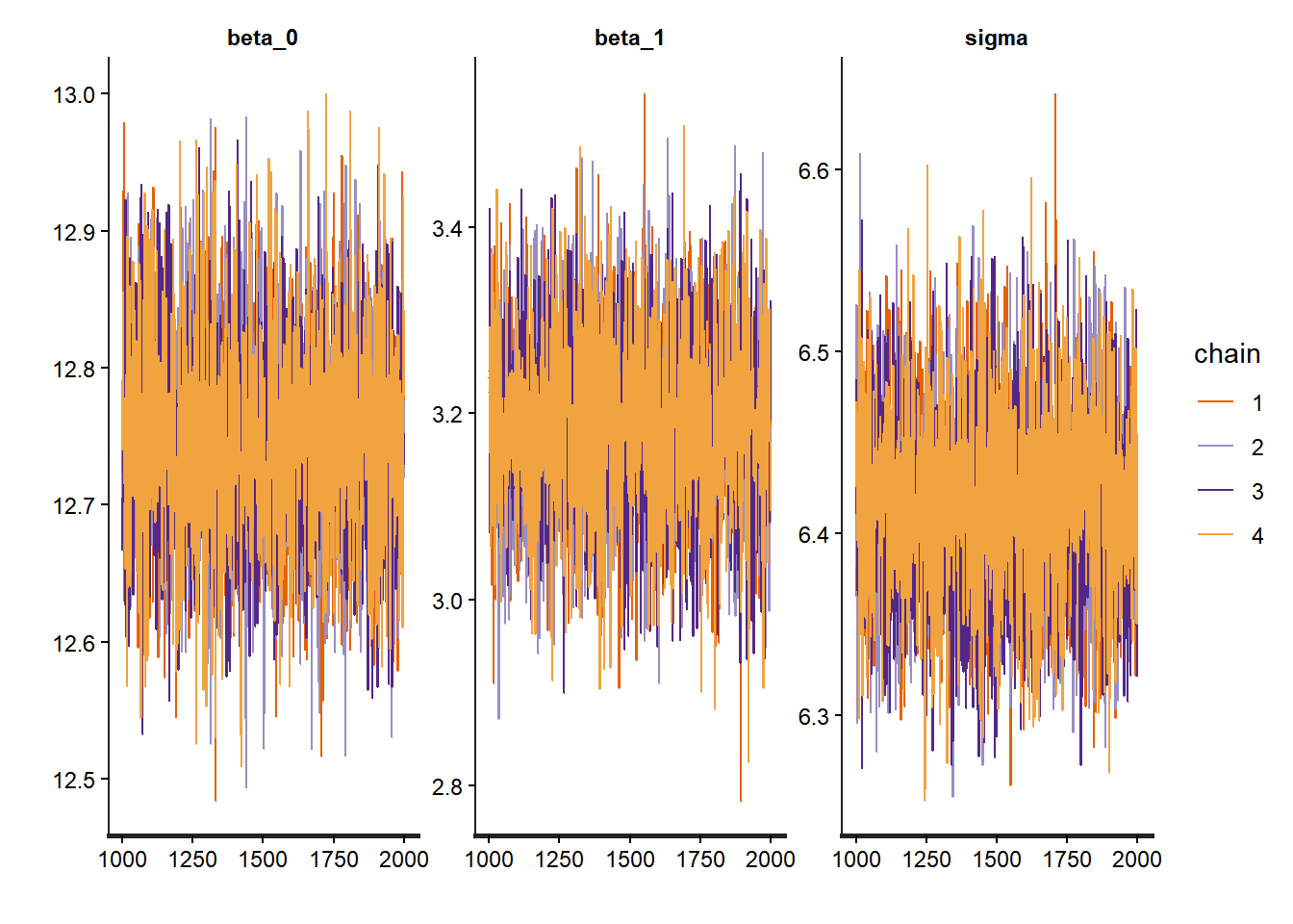
## Inference for Stan model: anon_model.
## 4 chains, each with iter=2000; warmup=1000; thin=1;
## post-warmup draws per chain=1000, total post-warmup draws=4000.
##
##         mean se_mean   sd  2.5%   25%   50%   75% 97.5% n_eff Rhat
## beta_0 12.75       0 0.08 12.60 12.70 12.75 12.80 12.90  4135    1
## beta_1  3.19       0 0.10  3.00  3.12  3.19  3.25  3.38  3756    1
## sigma   6.42       0 0.05  6.31  6.38  6.42  6.45  6.52  4138    1
##
## Samples were drawn using NUTS(diag_e) at Mon Nov 17 14:06:35 2025.
## For each parameter, n_eff is a crude measure of effective sample size,
## and Rhat is the potential scale reduction factor on split chains (at
## convergence, Rhat=1).
# Pairs plot for checking correlations between parameters
pairs(complete_pooling_fit, pars = c("beta_0", "beta_1", "sigma"))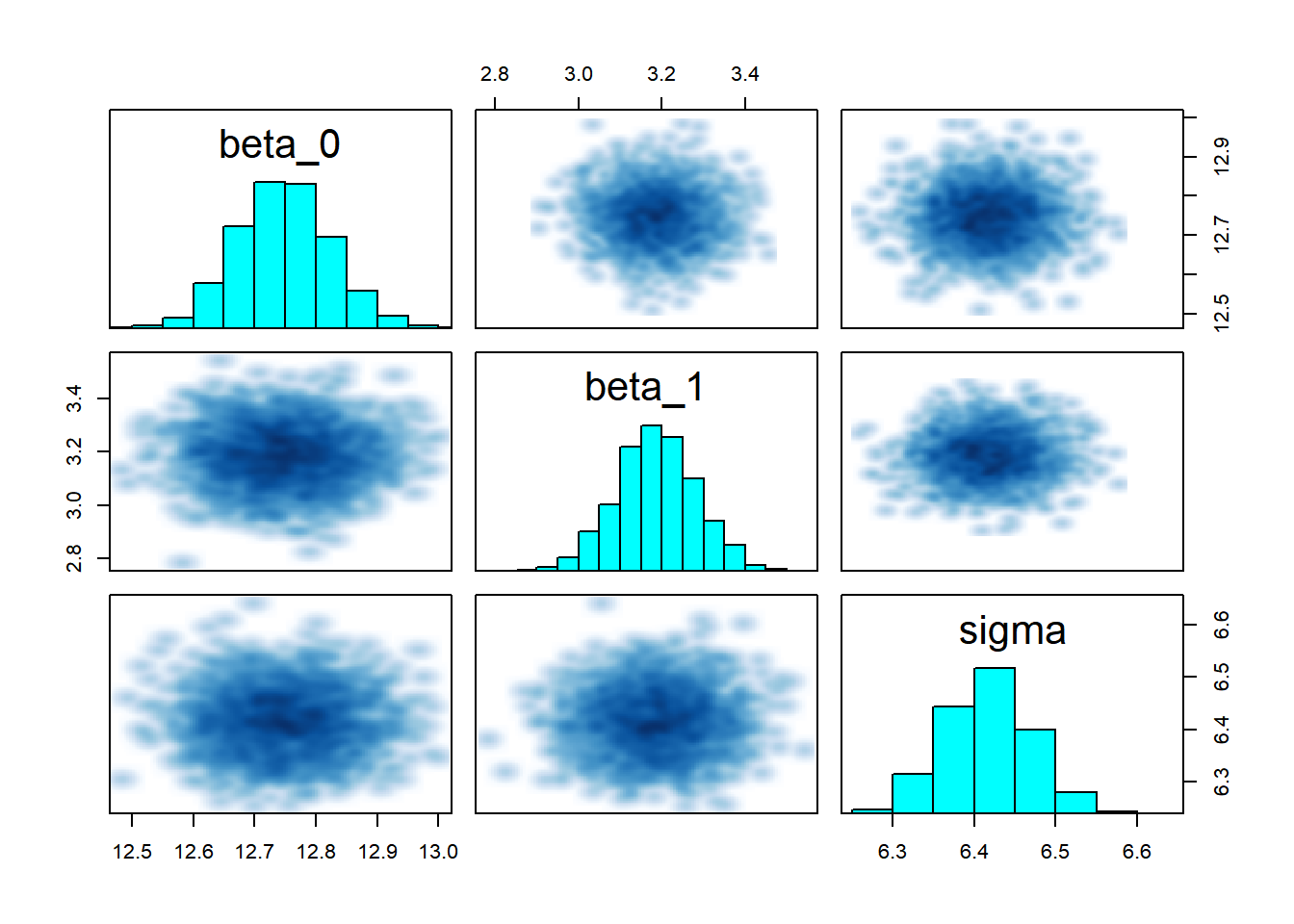
The trace plots should show good mixing and convergence for all parameters. The summary provides posterior means and credible intervals, which we can compare to the frequentist estimates.
# Compare Bayesian and frequentist estimates
bayes_summary <- summary(complete_pooling_fit, pars = c("beta_0", "beta_1", "sigma"))$summary
freq_summary <- summary(complete_pooling_model)$coefficients
freq_sigma <- sigma(complete_pooling_model)

comparison_df <- data.frame(
  Parameter = c("Intercept", "SES Slope", "Sigma"),
  Bayesian_Mean = bayes_summary[, "mean"],
  Bayesian_SD = bayes_summary[, "sd"],
  Frequentist_Estimate = c(freq_summary[1, "Estimate"], freq_summary[2, "Estimate"], freq_sigma),
  Frequentist_SE = c(freq_summary[1, "Std. Error"], freq_summary[2, "Std. Error"], NA)
)

# Reshape for plotting
comparison_long <- comparison_df %>%
  pivot_longer(cols = -Parameter,
               names_to = c("Method", "Stat"),
               names_pattern = "(.+)_(Mean|Estimate|SD|SE)") %>%
  pivot_wider(names_from = Stat, values_from = value) %>%
  mutate(Method = recode(Method,
                         Bayesian = "Bayesian",
                         Frequentist = "Frequentist"))

# Plot comparison
ggplot(comparison_long %>% filter(!is.na(Mean) | !is.na(Estimate)),
       aes(x = Parameter, color = Method)) +
  geom_point(aes(y = coalesce(Mean, Estimate)),
             position = position_dodge(width = 0.3), size = 3) +
  geom_errorbar(aes(ymin = coalesce(Mean, Estimate) - coalesce(SD, SE),
                    ymax = coalesce(Mean, Estimate) + coalesce(SD, SE)),
                width = 0.2, position = position_dodge(width = 0.3)) +
  theme_bw() +
  labs(title = "Bayesian vs. Frequentist Estimates",
       subtitle = "Error bars show ±1 SD/SE",
       x = "Parameter",
       y = "Estimate") +
  scale_color_manual(values = c("Bayesian" = "darkblue", "Frequentist" = "darkred"))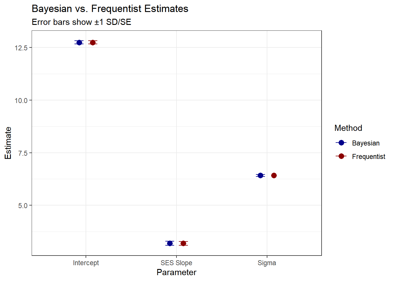
As expected, the estimates with uniformative priors should be similar to the maximum likelihood estimates.
4.5.5 Model 2: No Pooling
Now we’ll fit the opposite extreme: a completely separate regression for each school. This treats schools as fixed effects.
4.5.6 Mathematical Specification
For each school \(j \in \{1,\ldots,J\}\): \[ y_{ij} = \beta_{0j} + \beta_{1j} \cdot \text{ses}_{ij} + \epsilon_{ij} \]
where
- \(\beta_{0j}\) : A separate intercept for each school \(j\)
- \(\beta_{1j}\) : A separate slope for each school \(j\)
- \(\epsilon_{ij} \sim N(0, \sigma^2)\) : Residual error (we’ll use a common variance for simplicity, though we could also estimate separate variances)
We’re now estimating \(J\) separate intercepts and \(J\) separate slopes, for a total of \(2J = 320\) parameters, plus \(\sigma\).
4.5.7 Frequentist Approach
# Fit the no pooling model with fixed effects for each school
# The formula includes interactions between ses and school, plus main effects
no_pooling_model <- lm(mathach ~ 0 + ses:factor(schoolid) + factor(schoolid),
                       data = hsb_data)

# Summary is very long with 160 schools!
# Display only the first 15 parameters
summary(no_pooling_model)$coefficients[c(1:10, 161:170), ]
## Estimate Std. Error t value Pr(>|t|)
## factor(schoolid)1 10.8051320 1.078924 10.01473112 1.901154e-23
## factor(schoolid)2 13.1149374 1.232605 10.64001225 3.105054e-26
## factor(schoolid)3 8.0937790 1.050183 7.70701747 1.469690e-14
## factor(schoolid)4 16.1889592 2.043623 7.92169565 2.714100e-15
## factor(schoolid)5 12.7377629 1.032583 12.33582186 1.348276e-34
## factor(schoolid)6 11.3059042 1.106861 10.21438332 2.550337e-24
## factor(schoolid)7 9.7771939 1.145374 8.53624277 1.688906e-17
## factor(schoolid)8 18.3988853 1.611858 11.41470648 6.563076e-30
## factor(schoolid)9 17.2106429 1.289411 13.34768300 3.855413e-40
## factor(schoolid)10 12.5973695 1.486897 8.47225223 2.914943e-17
## ses:factor(schoolid)1 2.5085817 1.424328 1.76123832 7.824259e-02
## ses:factor(schoolid)2 3.2554487 1.848156 1.76145792 7.820544e-02
## ses:factor(schoolid)3 1.0759591 1.366096 0.78761625 4.309484e-01
## ses:factor(schoolid)4 0.1260242 2.897407 0.04349552 9.653078e-01
## ses:factor(schoolid)5 1.2739128 1.589299 0.80155667 4.228372e-01
## ses:factor(schoolid)6 5.0680087 1.711676 2.96084585 3.078453e-03
## ses:factor(schoolid)7 3.8543228 1.668358 2.31024878 2.090389e-02
## ses:factor(schoolid)8 1.8542944 1.747981 1.06082062 2.888087e-01
## ses:factor(schoolid)9 1.6005617 1.616532 0.99012063 3.221501e-01
## ses:factor(schoolid)10 6.2664969 1.546844 4.05115017 5.152829e-05Notice how many parameters we’re estimating! For schools with small sample sizes, these estimates will have very large standard errors. We show the estimates for the first 10 schools, where factor(schoolid)\(j\) refers to the intercept and ses:factor(schoolid)\(j\) for \(j=1,...,160\) refers to slope coefficient on the ses variable.
4.5.8 Bayesian Approach with Stan
We assign independent priors to each school’s parameters:
\[ \beta_{0j} \sim N(0, 10) \\ \beta_{1j} \sim N(0, 10) \\ \sigma \sim \text{Cauchy}^+(0, 5) \]
for \(j=1,\ldots,J\).
hsb_no_pooling_model <- "
data {
    int<lower=0> N;                    // Number of observations
    int<lower=1> J;                    // Number of schools
    array[N] int<lower=1, upper=J> schoolid; // School IDs
    vector[N] mathach;                 // Math achievement scores
    vector[N] ses;                     // Socio-economic status
}

parameters {
    vector[J] beta_0;                  // Intercepts for each school
    vector[J] beta_1;                  // Slopes for each school
    real<lower=0> sigma;               // Residual standard deviation
}

model {
    // Priors (independent for each school)
    beta_0 ~ normal(0, 10);
    beta_1 ~ normal(0, 10);
    sigma ~ cauchy(0, 5);

    // Likelihood
    for (n in 1:N) {
        mathach[n] ~ normal(beta_0[schoolid[n]] + beta_1[schoolid[n]] * ses[n], sigma);
    }
}

generated quantities {
    vector[N] log_lik;                 // For model comparison
    vector[N] mathach_rep;             // For posterior predictive checks

    for (n in 1:N) {
        log_lik[n] = normal_lpdf(mathach[n] |
                                  beta_0[schoolid[n]] + beta_1[schoolid[n]] * ses[n],
                                  sigma);
        mathach_rep[n] = normal_rng(beta_0[schoolid[n]] + beta_1[schoolid[n]] * ses[n],
                                     sigma);
    }
}
"

hsb_no_pooling_data <- list(
    N = nrow(hsb_data),
    J = length(unique(hsb_data$schoolid)),
    schoolid = as.integer(hsb_data$schoolid),
    mathach = hsb_data$mathach,
    ses = hsb_data$ses
)

no_pooling_fit <- stan(
    model_code = hsb_no_pooling_model,
    data = hsb_no_pooling_data,
    iter = 2000,
    chains = 4,
    seed = 123
)
Similar to before, we define the data, model and generated quantities blocks in the same fashion. Note that now we have a vector of \(\beta_{0}\) and \(\beta_{1}\) parameters, one for each school. As with before, we must check diagnostics to ensure convergence.
4.5.9 Diagnosing the Fit
We should inspect each trace plot, but for brevity we only show a few parameters here.
# Trace plots for a few school-specific parameters
traceplot(no_pooling_fit, pars = c("beta_0[1]", "beta_0[2]", "beta_1[1]", "beta_1[2]", "sigma"))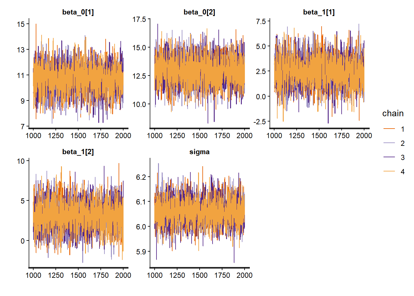
# Summary
print(no_pooling_fit, pars = c("beta_0[1]", "beta_0[10]", "beta_1[1]", "beta_1[10]", "sigma"))
## Inference for Stan model: anon_model.
## 4 chains, each with iter=2000; warmup=1000; thin=1;
## post-warmup draws per chain=1000, total post-warmup draws=4000.
##
## mean se_mean sd 2.5% 25% 50% 75% 97.5% n_eff Rhat
## beta_0[1] 10.69 0.02 1.06 8.54 9.98 10.70 11.41 12.73 3953 1
## beta_0[10] 12.41 0.03 1.48 9.52 11.42 12.37 13.44 15.37 2965 1
## beta_1[1] 2.40 0.02 1.39 -0.32 1.47 2.38 3.31 5.25 3441 1
## beta_1[10] 6.32 0.03 1.56 3.11 5.33 6.34 7.39 9.28 3093 1
## sigma 6.06 0.00 0.05 5.97 6.03 6.06 6.09 6.16 4306 1
##
## Samples were drawn using NUTS(diag_e) at Mon Nov 17 14:10:36 2025.
## For each parameter, n_eff is a crude measure of effective sample size,
## and Rhat is the potential scale reduction factor on split chains (at
## convergence, Rhat=1).The summary output also reveals useful information convergence. Rhat values close to 1 indicate good convergence, while effective sample sizes (n_eff) should be reasonably large.
# Extract parameter estimates for no pooling model
no_pool_beta0 <- summary(no_pooling_fit, pars = "beta_0")$summary
no_pool_beta1 <- summary(no_pooling_fit, pars = "beta_1")$summary

# Get complete pooling estimates with credible intervals
complete_beta0_summary <- summary(complete_pooling_fit, pars = "beta_0")$summary
complete_beta0_mean <- complete_beta0_summary[1, "mean"]
complete_beta0_lower <- complete_beta0_summary[1, "2.5%"]
complete_beta0_upper <- complete_beta0_summary[1, "97.5%"]

complete_beta1_summary <- summary(complete_pooling_fit, pars = "beta_1")$summary
complete_beta1_mean <- complete_beta1_summary[1, "mean"]
complete_beta1_lower <- complete_beta1_summary[1, "2.5%"]
complete_beta1_upper <- complete_beta1_summary[1, "97.5%"]

# Create data frame for plotting intercepts
intercept_df <- data.frame(
  school = 1:nrow(no_pool_beta0),
  mean = no_pool_beta0[, "mean"],
  lower = no_pool_beta0[, "2.5%"],
  upper = no_pool_beta0[, "97.5%"],
  n_students = school_counts$n_students
) %>%
  arrange(mean) %>%
  mutate(school_rank = row_number())

# Plot intercepts
ggplot(intercept_df, aes(x = school_rank, y = mean)) +
  geom_pointrange(aes(ymin = lower, ymax = upper),
                  size = 0.2, alpha = 0.5) +
  geom_hline(yintercept = complete_beta0_mean,
             color = "blue", linetype = "dashed", size = 1) +
  geom_ribbon(aes(ymin = complete_beta0_lower, ymax = complete_beta0_upper),
              fill = "blue", alpha = 0.2) +
  theme_bw() +
  labs(title = "No Pooling: School-Specific Intercepts vs Complete Pooling",
       subtitle = "Blue dashed line shows complete pooling mean; shaded area shows 95% CI",
       x = "School (Ranked by Intercept)",
       y = "Intercept (95% Credible Interval)")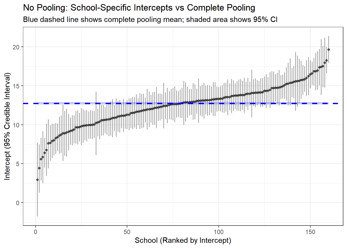
# Create data frame for plotting slopes
slope_df <- data.frame(
  school = 1:nrow(no_pool_beta1),
  mean = no_pool_beta1[, "mean"],
  lower = no_pool_beta1[, "2.5%"],
  upper = no_pool_beta1[, "97.5%"],
  n_students = school_counts$n_students
) %>%
  arrange(mean) %>%
  mutate(school_rank = row_number())

# Plot slopes
ggplot(slope_df, aes(x = school_rank, y = mean)) +
  geom_pointrange(aes(ymin = lower, ymax = upper),
                  size = 0.2, alpha = 0.5) +
  geom_hline(yintercept = complete_beta1_mean,
             color = "blue", linetype = "dashed", size = 1) +
  geom_ribbon(aes(ymin = complete_beta1_lower, ymax = complete_beta1_upper),
              fill = "blue", alpha = 0.2) +
  theme_bw() +
  labs(title = "No Pooling: School-Specific SES Slopes vs Complete Pooling",
       subtitle = "Blue dashed line shows complete pooling mean; shaded area shows 95% CI",
       x = "School (Ranked by SES Slope)",
       y = "SES Slope (95% Credible Interval)")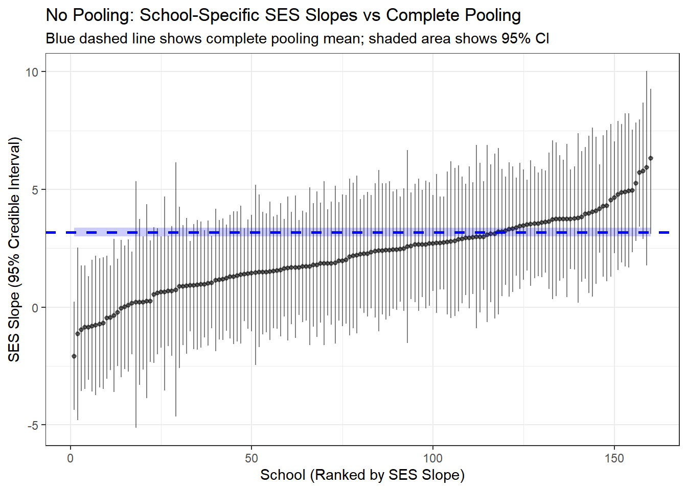
Here we compare the results from the complete pooled model and the no pooling. The line in blue is the result of no-pooling, and each vertical line is a posterior estimate and credible interval for the intercept and slope of each school from the no pooling model.
4.5.10 Model 3: Partial Pooling (Hierarchical Model)
Now we arrive at the hierarchical model, which represents the optimal middle ground. This model assumes that school-specific parameters are drawn from a common population distribution.
4.5.10.1 Mathematical Specification
The hierarchical structure has three levels:
Level 1 (Student-level): \[ y_{ij} \sim N(\beta_{0j} + \beta_{1j} \cdot \text{ses}_{ij}, \sigma) \]
Level 2 (School-level): \[ \beta_{0j} \sim N(\mu_{\beta_0}, \tau_{\beta_0}) \\ \beta_{1j} \sim N(\mu_{\beta_1}, \tau_{\beta_1}) \]
Level 3 (Population-level hyperpriors): \[ \mu_{\beta_0}, \mu_{\beta_1} \sim N(0, 10) \\ \tau_{\beta_0}, \tau_{\beta_1} \sim \text{Cauchy}^+(0, 5) \\ \sigma \sim \text{Cauchy}^+(0, 5) \]
4.5.10.2 Understanding the Parameters
- \(\mu_{\beta_0}\): Grand mean intercept (average math achievement across all schools for students with average SES)
- \(\mu_{\beta_1}\): Grand mean slope (average effect of SES on math achievement across all schools)
- \(\tau_{\beta_0}\): Between-school standard deviation in intercepts (how much do schools differ in baseline achievement?)
- \(\tau_{\beta_1}\): Between-school standard deviation in slopes (how much do schools differ in the SES effect?)
- \(\beta_{0j}\): School-specific intercept (pulled toward \(\mu_{\beta_0}\) based on data and \(\tau_{\beta_0}\))
- \(\beta_{1j}\): School-specific slope (pulled toward \(\mu_{\beta_1}\) based on data and \(\tau_{\beta_1}\))
- \(\sigma\): Within-school residual standard deviation
4.5.10.3 The “Partial Pooling” Mechanism
The magic of hierarchical models lies in how they estimate school-specific parameters. Each \(\beta_{0j}\) is a compromise between:
- The school’s own data (the “no pooling” estimate)
- The population mean \(\mu_{\beta_0}\) (the “complete pooling” estimate)
The weight given to each depends on: - Sample size: Schools with more students rely more on their own data - Between-group variation (\(\tau_{\beta_0}\)): If schools are very different, less pooling occurs - Within-group variation (\(\sigma\)): If student-level noise is high, more pooling toward the population mean occurs
This automatic, data-driven regularization is why hierarchical models typically outperform both extremes.
4.5.10.4 Fitting the Model with Stan
hsb_partial_model <- "
data {
    int<lower=0> N;                    // Number of observations
    int<lower=1> J;                    // Number of schools
    array[N] int<lower=1, upper=J> schoolid; // School IDs
    vector[N] mathach;                 // Math achievement scores
    vector[N] ses;                     // Socio-economic status
}

parameters {
    real mu_beta_0;                    // Grand mean intercept
    real mu_beta_1;                    // Grand mean slope
    real<lower=0> tau_beta_0;          // Between-school SD of intercepts
    real<lower=0> tau_beta_1;          // Between-school SD of slopes
    vector[J] beta_0;                  // School-specific intercepts
    vector[J] beta_1;                  // School-specific slopes
    real<lower=0> sigma;               // Within-school residual SD
}

model {
    // Hyperpriors
    mu_beta_0 ~ normal(0, 10);
    mu_beta_1 ~ normal(0, 10);
    tau_beta_0 ~ cauchy(0, 5);
    tau_beta_1 ~ cauchy(0, 5);
    sigma ~ cauchy(0, 5);

    // Hierarchical priors for school-specific parameters
    beta_0 ~ normal(mu_beta_0, tau_beta_0);
    beta_1 ~ normal(mu_beta_1, tau_beta_1);

    // Likelihood
    for (n in 1:N) {
        mathach[n] ~ normal(beta_0[schoolid[n]] + beta_1[schoolid[n]] * ses[n], sigma);
    }
}

generated quantities {
    vector[N] log_lik;                 // For model comparison
    vector[N] mathach_rep;             // For posterior predictive checks

    for (n in 1:N) {
        log_lik[n] = normal_lpdf(mathach[n] |
                                  beta_0[schoolid[n]] + beta_1[schoolid[n]] * ses[n],
                                  sigma);
        mathach_rep[n] = normal_rng(beta_0[schoolid[n]] + beta_1[schoolid[n]] * ses[n],
                                     sigma);
    }
}
"

hsb_partial_data <- list(
    N = nrow(hsb_data),
    J = length(unique(hsb_data$schoolid)),
    schoolid = as.integer(hsb_data$schoolid),
    mathach = hsb_data$mathach,
    ses = hsb_data$ses
)

partial_pooling_fit <- stan(
    model_code = hsb_partial_model,
    data = hsb_partial_data,
    iter = 2000,
    chains = 4,
    seed = 123
)
4.5.10.5 Diagnosing the Fit
# Trace plots for hyperparameters
traceplot(partial_pooling_fit,
          pars = c("mu_beta_0", "mu_beta_1", "tau_beta_0", "tau_beta_1", "sigma"))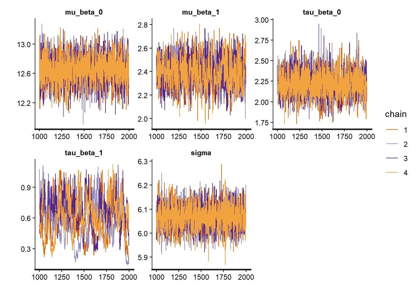
# Trace plots for betas
traceplot(partial_pooling_fit,
          pars = c("beta_0[1]", "beta_0[2]", "beta_0[3]", "beta_0[4]", "beta_0[5]"))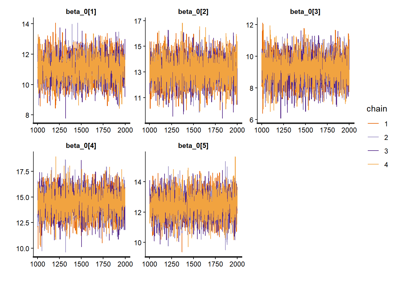
# Pairs for betas
pairs(partial_pooling_fit,
          pars = c("beta_0[1]", "beta_0[2]", "beta_0[3]", "beta_0[4]", "beta_0[5]"))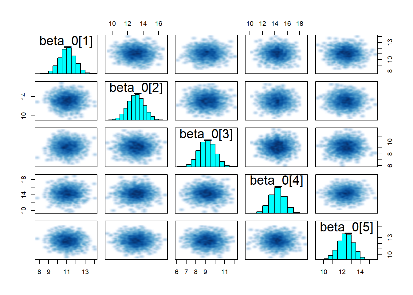
# Summary of hyperparameters
print(partial_pooling_fit,
      pars = c("mu_beta_0", "mu_beta_1", "tau_beta_0", "tau_beta_1", "sigma"))
## Inference for Stan model: anon_model.
## 4 chains, each with iter=2000; warmup=1000; thin=1;
## post-warmup draws per chain=1000, total post-warmup draws=4000.
##
## mean se_mean sd 2.5% 25% 50% 75% 97.5% n_eff Rhat
## mu_beta_0 12.65 0.00 0.19 12.27 12.52 12.65 12.77 13.02 4444 1.00
## mu_beta_1 2.40 0.00 0.12 2.16 2.31 2.39 2.48 2.63 893 1.00
## tau_beta_0 2.21 0.00 0.15 1.92 2.11 2.21 2.31 2.53 2727 1.00
## tau_beta_1 0.61 0.02 0.19 0.25 0.47 0.61 0.74 0.98 110 1.02
## sigma 6.07 0.00 0.05 5.97 6.04 6.07 6.11 6.17 4093 1.00
##
## Samples were drawn using NUTS(diag_e) at Mon Nov 17 14:14:27 2025.
## For each parameter, n_eff is a crude measure of effective sample size,
## and Rhat is the potential scale reduction factor on split chains (at
## convergence, Rhat=1).# Look at a few school-specific parameters
print(partial_pooling_fit,
pars = c("beta_0[1]", "beta_0[10]", "beta_1[1]", "beta_1[10]"))## Inference for Stan model: anon_model.
## 4 chains, each with iter=2000; warmup=1000; thin=1;
## post-warmup draws per chain=1000, total post-warmup draws=4000.
##
## mean se_mean sd 2.5% 25% 50% 75% 97.5% n_eff Rhat
## beta_0[1] 11.06 0.01 0.84 9.42 10.51 11.06 11.62 12.68 5125 1
## beta_0[10] 14.40 0.02 1.03 12.35 13.73 14.41 15.09 16.43 4004 1
## beta_1[1] 2.47 0.01 0.59 1.30 2.10 2.46 2.83 3.66 5166 1
## beta_1[10] 3.01 0.03 0.66 1.87 2.54 2.94 3.42 4.44 493 1
##
## Samples were drawn using NUTS(diag_e) at Mon Nov 17 14:14:27 2025.
## For each parameter, n_eff is a crude measure of effective sample size,
## and Rhat is the potential scale reduction factor on split chains (at
## convergence, Rhat=1).# Pairs plot
pairs(partial_pooling_fit,
pars = c("mu_beta_0", "mu_beta_1", "tau_beta_0", "tau_beta_1", "sigma"))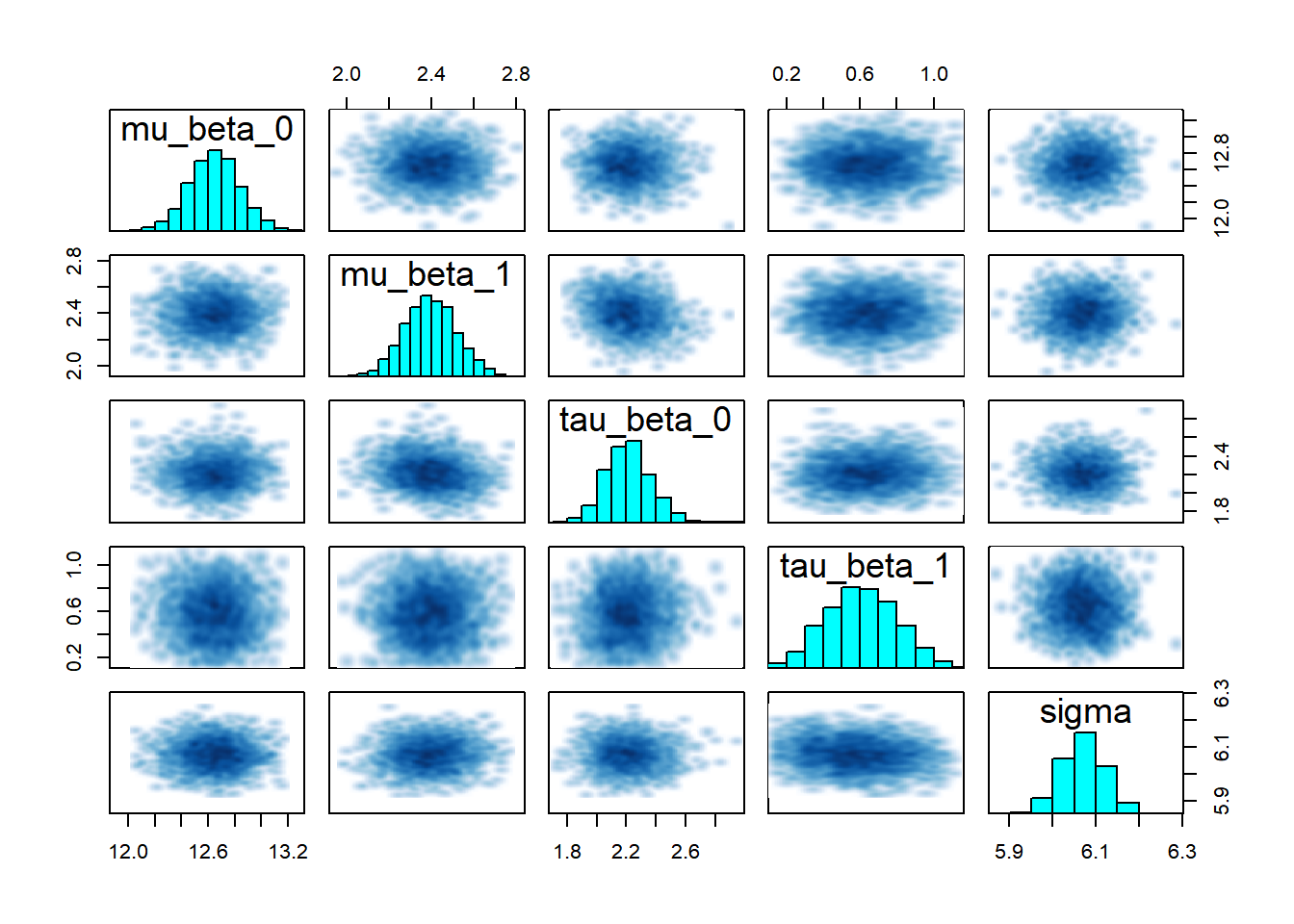
Note that it is important to pay attention to any of Stan’s diagnostic warnings, such as those related to divergent transitions, are critically important because they often indicate problems with the sampling process and suggest that the Markov Chain is failing to explore the target distribution effectively (especially common in complex or hierarchical models), they should always be interpreted in context.
4.6 Comparing the Three Models
Now let’s directly compare estimates from the three approaches to see how partial pooling works in practice.
4.6.1 Visualizing Shrinkage
One of the most striking features of hierarchical models is “shrinkage”: the school-specific estimates in the partial pooling model are pulled toward the population mean, especially for schools with small sample sizes.
# Extract posterior means for school-specific intercepts
no_pool_intercepts <- summary(no_pooling_fit, pars = "beta_0")$summary[, "mean"]
partial_pool_intercepts <- summary(partial_pooling_fit, pars = "beta_0")$summary[, "mean"]
complete_pool_intercept <- summary(complete_pooling_fit, pars = "beta_0")$summary[, "mean"]

# Create a comparison data frame
comparison_df <- data.frame(
  school = 1:length(no_pool_intercepts),
  no_pooling = no_pool_intercepts,
  partial_pooling = partial_pool_intercepts,
  complete_pooling = rep(complete_pool_intercept, length(no_pool_intercepts)),
  n_students = school_counts$n_students
)

# Plot: No pooling vs. Partial pooling
ggplot(comparison_df, aes(x = no_pooling, y = partial_pooling, size = n_students)) +
  geom_abline(intercept = 0, slope = 1, linetype = "dashed", color = "gray50") +
  geom_hline(yintercept = complete_pool_intercept, color = "blue", alpha = 0.5) +
  geom_point(alpha = 0.6) +
  theme_bw() +
  labs(title = "Shrinkage in Hierarchical Models",
       subtitle = "School-specific intercepts: No Pooling vs. Partial Pooling",
       x = "No Pooling Estimate",
       y = "Partial Pooling Estimate",
       size = "Number of Students") +
  annotate("text", x = min(no_pool_intercepts), y = complete_pool_intercept + 1,
           label = "Complete Pooling Estimate", color = "blue", hjust = 0)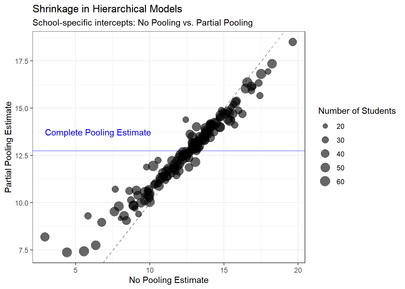
4.6.2 Comparing Uncertainty
Let’s also look at how uncertainty in estimates differs across models.
# Extract posterior standard deviations (uncertainty)
no_pool_sd <- summary(no_pooling_fit, pars = "beta_0")$summary[, "sd"]
partial_pool_sd <- summary(partial_pooling_fit, pars = "beta_0")$summary[, "sd"]

uncertainty_df <- data.frame(
  school = 1:length(no_pool_sd),
  no_pooling_sd = no_pool_sd,
  partial_pooling_sd = partial_pool_sd,
  n_students = school_counts$n_students
)

ggplot(uncertainty_df, aes(x = n_students)) +
  geom_point(aes(y = no_pooling_sd, color = "No Pooling"), alpha = 0.6) +
  geom_point(aes(y = partial_pooling_sd, color = "Partial Pooling"), alpha = 0.6) +
  theme_bw() +
  scale_color_manual(values = c("No Pooling" = "red", "Partial Pooling" = "darkgreen")) +
  labs(title = "Uncertainty in School-Specific Intercepts",
       x = "Number of Students in School",
       y = "Posterior Standard Deviation",
       color = "Model") +
  scale_x_log10()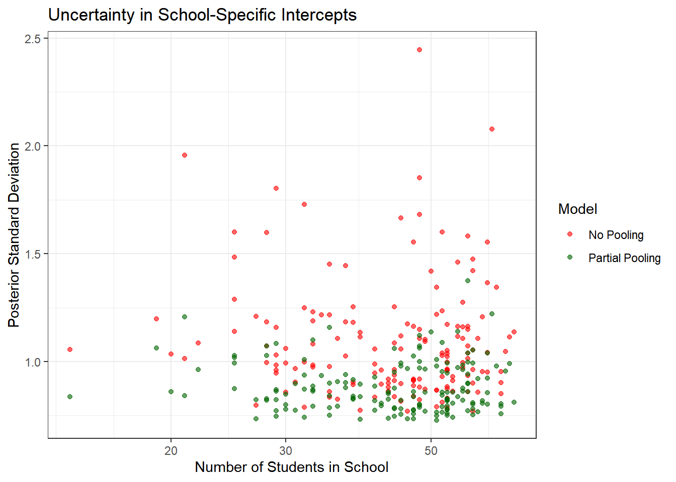
Key insights:
- No pooling models have much higher uncertainty, especially for small schools
- Partial pooling reduces uncertainty by borrowing strength from the population
- The benefit is greatest for schools with few students
- Even large schools benefit slightly from partial pooling
What to observe:
- Points below the diagonal line show shrinkage toward the population mean
- Smaller schools (smaller points) show more shrinkage—they’re pulled more strongly toward the population mean
- Larger schools (larger points) stay closer to their no-pooling estimates
- The blue horizontal line shows where complete pooling would place all schools
This shrinkage is not a flaw—it’s a feature! It represents optimal bias-variance tradeoff and leads to better predictions, especially for small schools.
4.7 Formal Model Comparison
To rigorously compare our three models, we’ll use two complementary approaches:
- Leave-One-Out Cross-Validation (LOO-CV): Estimates out-of-sample predictive performance
- Widely Applicable Information Criterion (WAIC): Another measure of predictive accuracy
Both methods penalize model complexity and favor models that make better predictions on unseen data. Lower values indicate better models.
4.7.1 Computing LOO-CV and WAIC
The loo package makes this straightforward. We use the log-likelihood values we saved in the generated quantities block.
# Extract log-likelihood for each model
log_lik_complete <- extract_log_lik(complete_pooling_fit, merge_chains = FALSE)
log_lik_no_pool <- extract_log_lik(no_pooling_fit, merge_chains = FALSE)
log_lik_partial <- extract_log_lik(partial_pooling_fit, merge_chains = FALSE)

# Compute LOO-CV
loo_complete <- loo(log_lik_complete, r_eff = relative_eff(log_lik_complete))
loo_no_pool <- loo(log_lik_no_pool, r_eff = relative_eff(log_lik_no_pool))
loo_partial <- loo(log_lik_partial, r_eff = relative_eff(log_lik_partial))

# Compute WAIC
waic_complete <- waic(log_lik_complete)
waic_no_pool <- waic(log_lik_no_pool)
## Warning:
## 46 (0.6%) p_waic estimates greater than 0.4. We recommend trying loo instead.waic_partial <- waic(log_lik_partial)
# Compare models
loo_compare(loo_complete, loo_no_pool, loo_partial)## elpd_diff se_diff
## model3 0.0 0.0
## model2 -67.6 13.3
## model1 -314.9 24.5## elpd_diff se_diff
## model3 0.0 0.0
## model2 -65.6 13.3
## model1 -315.2 24.5In both cases, model3 has the best fit.
4.7.2 Interpreting the Results
# Create a summary table
comparison_table <- data.frame(
  Model = c("Complete Pooling", "No Pooling", "Partial Pooling"),
  LOOIC = c(loo_complete$estimates["looic", "Estimate"],
            loo_no_pool$estimates["looic", "Estimate"],
            loo_partial$estimates["looic", "Estimate"]),
  LOOIC_SE = c(loo_complete$estimates["looic", "SE"],
               loo_no_pool$estimates["looic", "SE"],
               loo_partial$estimates["looic", "SE"]),
  p_loo = c(loo_complete$estimates["p_loo", "Estimate"],
            loo_no_pool$estimates["p_loo", "Estimate"],
            loo_partial$estimates["p_loo", "Estimate"])
)

print(comparison_table)
## Model LOOIC LOOIC_SE p_loo
## 1 Complete Pooling 47103.47 98.93721 2.558731
## 2 No Pooling 46608.88 105.11897 308.270031
## 3 Partial Pooling 46473.70 102.08652 163.916961What to look for:
- LOOIC (LOO Information Criterion): Lower is better. Differences > 4 are typically considered meaningful
- Standard Error: Quantifies uncertainty in the LOOIC estimate
- p_loo (Effective number of parameters): Indicates model complexity
- Complete pooling: ~3 parameters (intercept, slope, sigma)
- No pooling: ~321 parameters (160 intercepts + 160 slopes + sigma)
- Partial pooling: Between the two, depends on how much variation exists between schools
Expected results: The partial pooling model have the best (lowest) LOOIC, indicating superior out-of-sample predictive performance. The complete pooling model likely underfits (ignoring important school differences), while the no pooling model likely overfits (especially for small schools). The hierarchical model achieves the best balance.
4.7.3 Model Weights
We can also compute model weights using the “stacking” method, which tells us how much weight to give each model in an ensemble.
# Compute stacking weights
model_weights <- loo_model_weights(
  list(complete = loo_complete,
       no_pool = loo_no_pool,
       partial = loo_partial),
  method = "stacking"
)

#Model Weights (Stacking):
print(model_weights)
## Method: stacking
## ------
## weight
## complete 0.007
## no_pool 0.111
## partial 0.882We observe the partial model to have 0.882, indicating it strongly preferred over the other two.
4.8 Posterior Predictive Checks
Another powerful tool available in the Bayesian toolbox is the ability to simulate data from the posterior predictive distribution. This allows us to see how well our model can replicate the observed data. Here, we will compare the observed math achievement scores to those predicted by our models for a few selected schools.
Model comparison statistics tell us which model predicts best on average, but they don’t reveal how models fail or succeed. Posterior predictive checks (PPCs) allow us to visually assess whether our model can generate data that looks like the observed data.
The idea is simple: 1. Use our fitted model to generate many replicated datasets 2. Compare these simulated datasets to the actual data 3. If the model is good, simulated data should resemble real data
We saved predicted values in the mathach_rep variable in our generated quantities block.
4.8.1 Visual Posterior Predictive Checks
# Extract posterior predictive samples
y_rep_complete <- extract(complete_pooling_fit)$mathach_rep
y_rep_no_pool <- extract(no_pooling_fit)$mathach_rep
y_rep_partial <- extract(partial_pooling_fit)$mathach_rep

# Observed data
y_obs <- hsb_data$mathach
4.8.1.1 Check 1: Distribution of the Outcome
Does our model reproduce the overall distribution of math achievement scores?
# Complete pooling
ppc_dens_overlay(y_obs, y_rep_complete[1:100, ]) +
  ggtitle("Complete Pooling: Posterior Predictive Distribution") +
  theme_bw()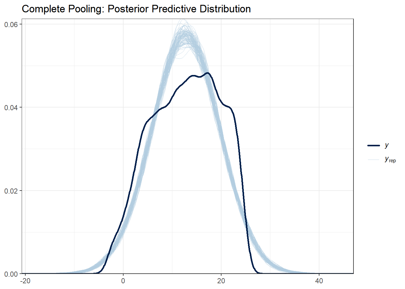
# No pooling
ppc_dens_overlay(y_obs, y_rep_no_pool[1:100, ]) +
  ggtitle("No Pooling: Posterior Predictive Distribution") +
  theme_bw()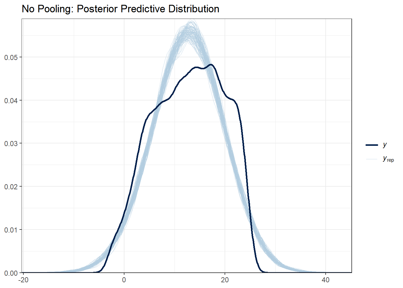
# Partial pooling
ppc_dens_overlay(y_obs, y_rep_partial[1:100, ]) +
  ggtitle("Partial Pooling: Posterior Predictive Distribution") +
  theme_bw()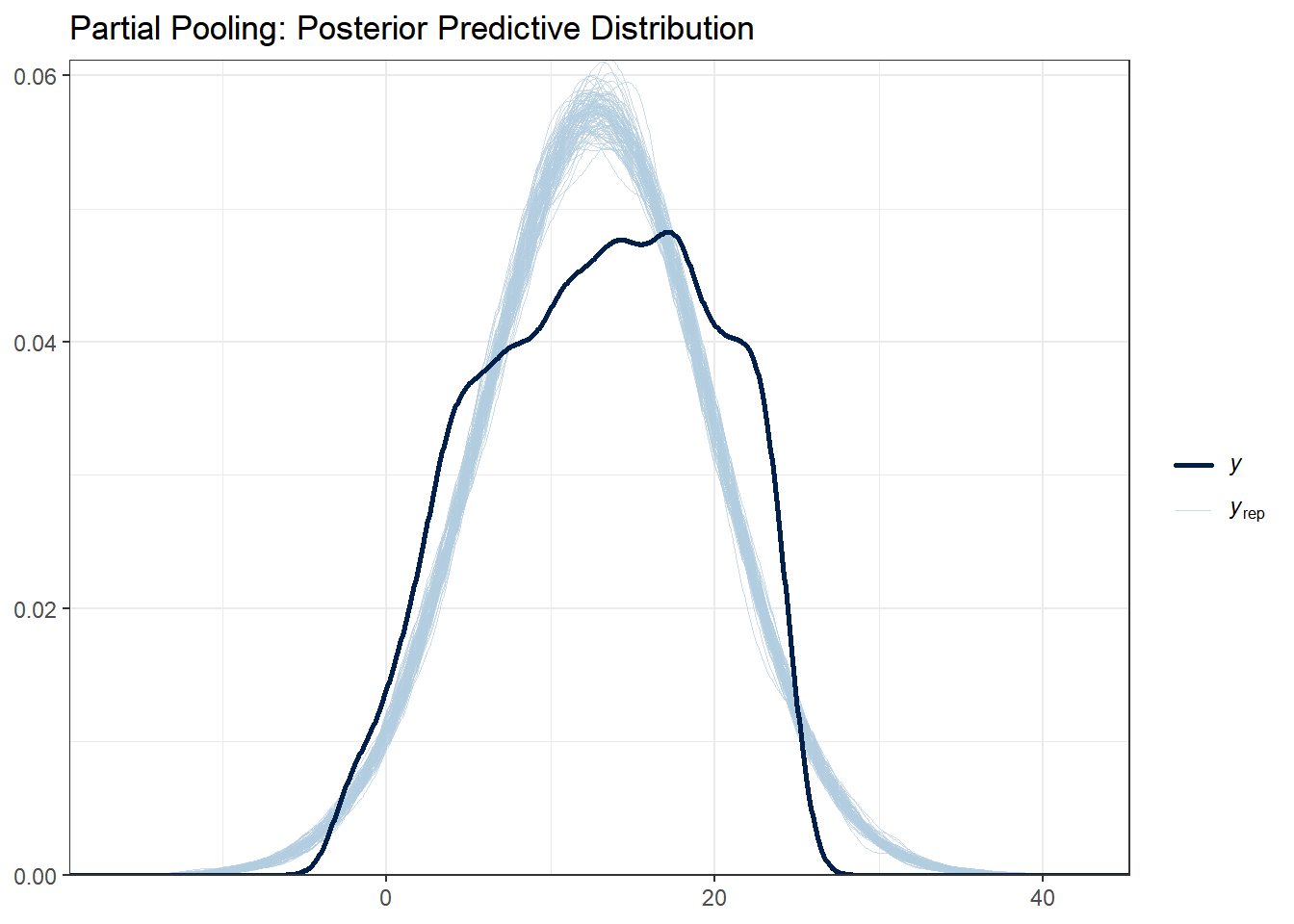
What to look for:
- The light blue lines are simulated datasets; the dark line is the observed data
- Good fit: Observed data falls within the range of simulated data
- All three models should capture the basic distribution since they all use normal likelihoods
With this data set there are not huge differences between each of the models. Note that posterior predictive distributions do not indicate whether any one model is better than the other, rather it looks at each of them asks “does the model resemble the observe data in any way?”.
4.8.1.2 Check 2: Test Statistics
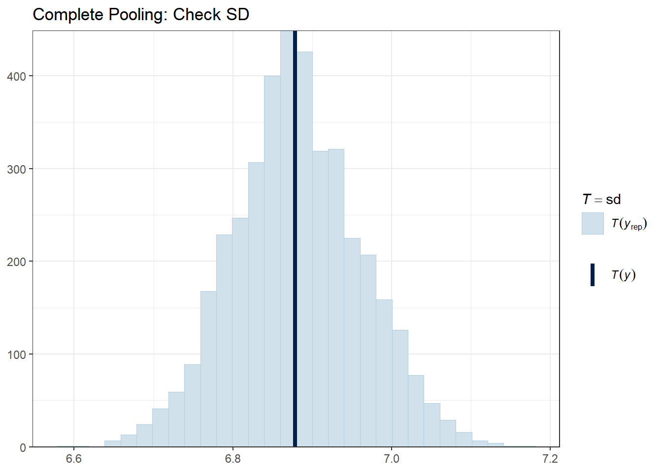
Let’s check whether our models can reproduce key features of the data, such as the mean, standard deviation, minimum, and maximum.
# Complete pooling
ppc_stat(y_obs, y_rep_complete, stat = "mean") +
  ggtitle("Complete Pooling: Check Mean") +
  theme_bw()
# Partial pooling
ppc_stat(y_obs, y_rep_partial, stat = "mean") +
  ggtitle("Partial Pooling: Check Mean") +
  theme_bw()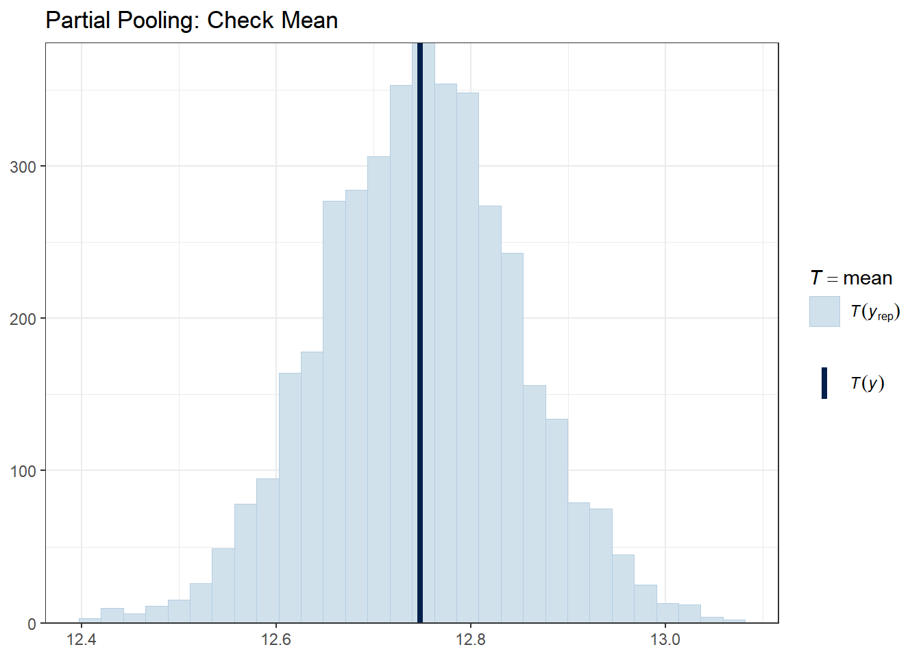
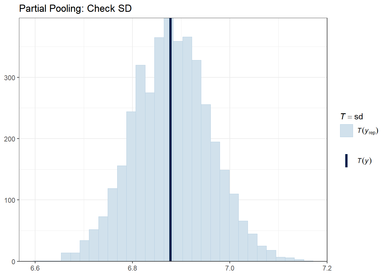
The vertical line shows the observed statistic. If it falls well within the distribution of simulated statistics (the histogram), the model is capturing that feature well.
4.8.1.3 Check 3: Predictions vs. Observed (School-Level)
A powerful check is to see if models correctly capture school-level patterns. Let’s look at a few schools.
# Select a few schools with varying sizes
selected_schools <- c(1, 25, 50, 100, 150)

for (school in selected_schools) {
  school_data <- hsb_data %>% filter(schoolid == school)
  school_indices <- which(hsb_data$schoolid == school)

  cat("\nSchool", school, "- Number of students:", nrow(school_data), "\n")

  # Partial pooling PPC for this school
  print(
    ppc_dens_overlay(school_data$mathach, y_rep_partial[1:50, school_indices]) +
      ggtitle(paste("School", school, "- Partial Pooling")) +
      theme_bw()
  )
}
##
## School 1 - Number of students: 47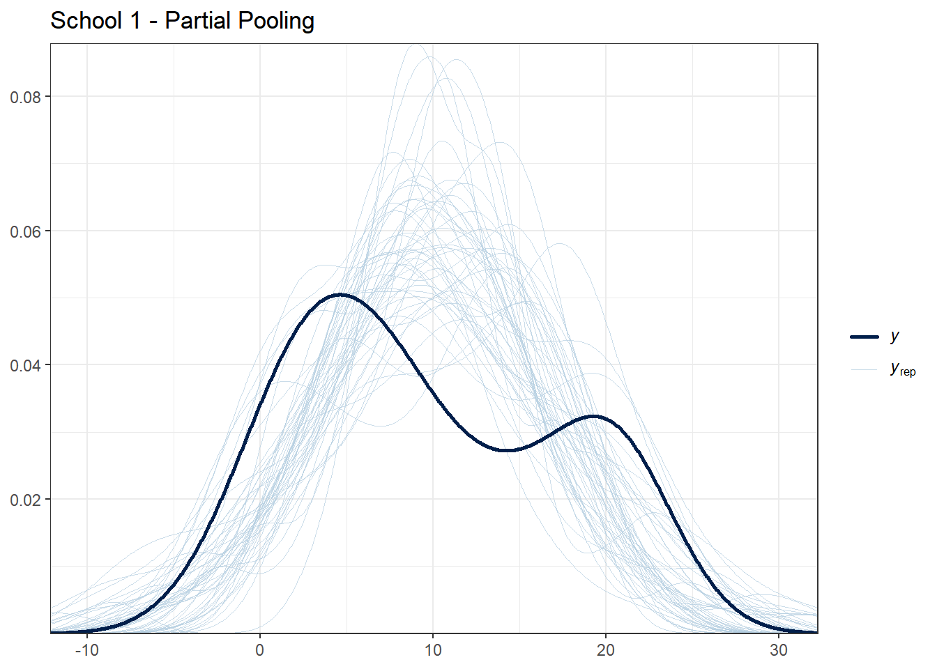
##
## School 25 - Number of students: 52
##
## School 50 - Number of students: 38
##
## School 100 - Number of students: 54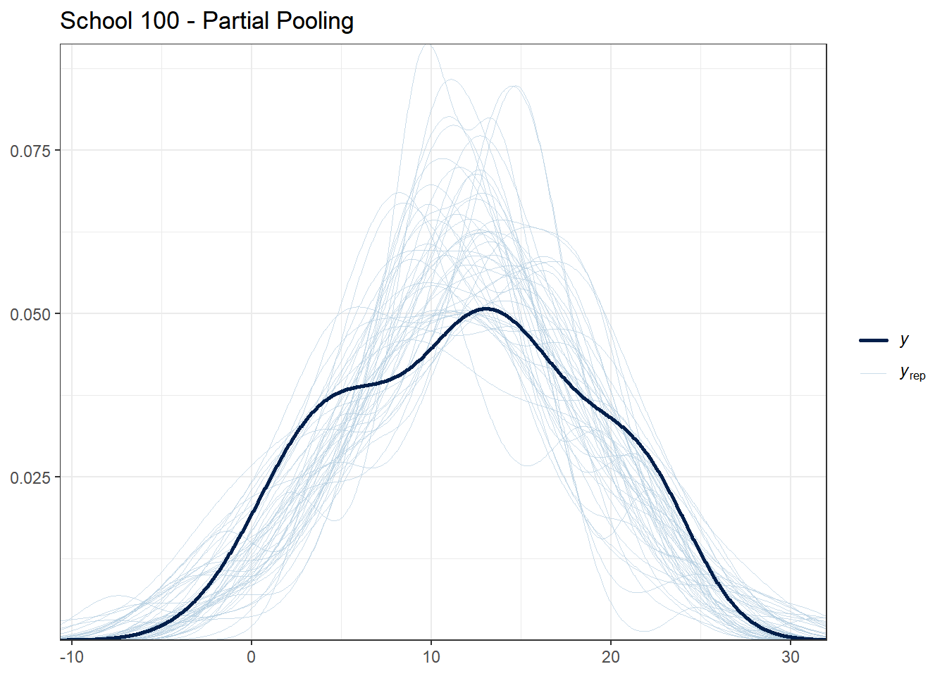
##
## School 150 - Number of students: 53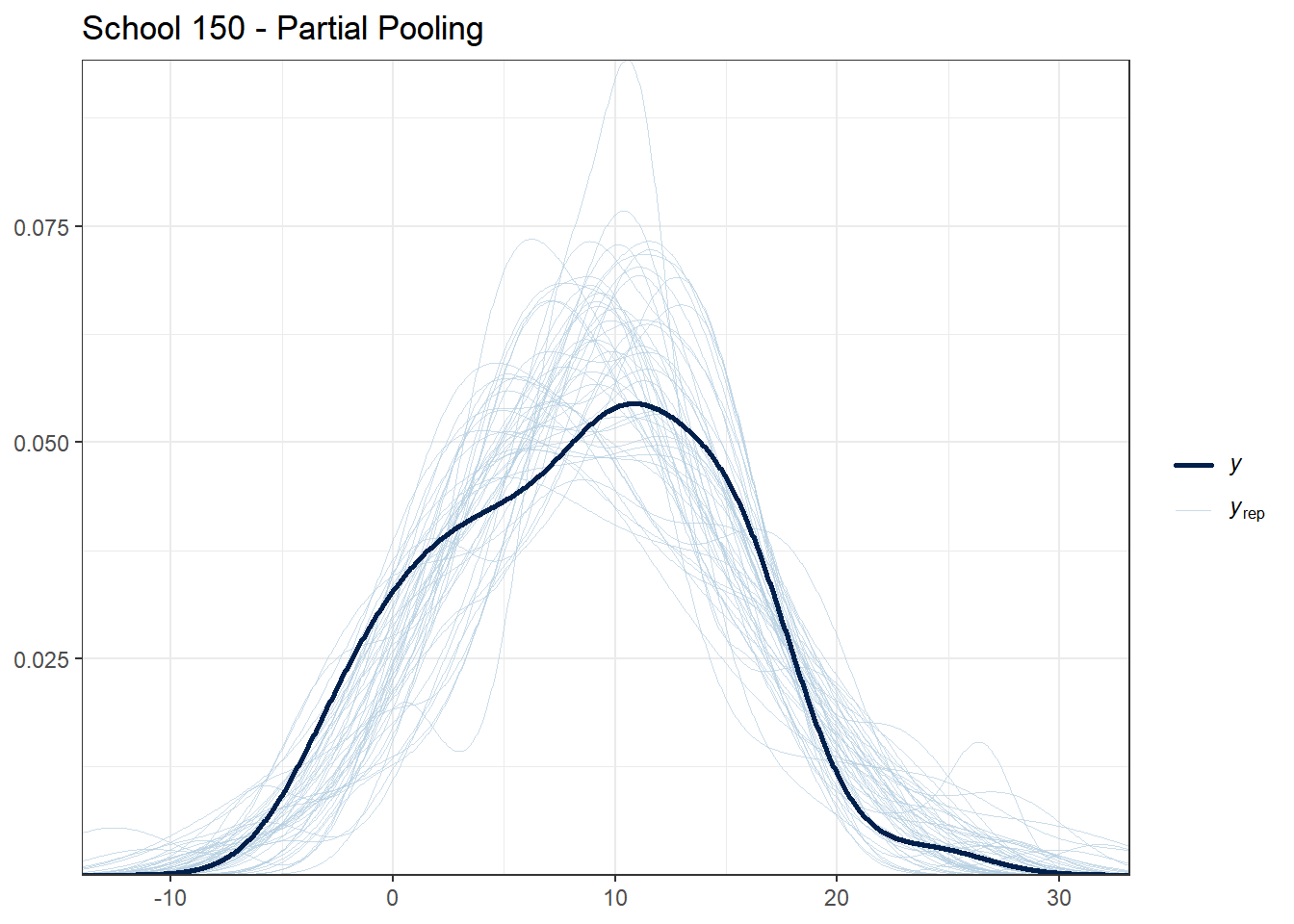
What to look for:
- For schools with many students, all models should fit reasonably well
- For schools with few students, partial pooling should provide more stable predictions
- If the observed data (dark line) falls far outside the posterior predictive distribution, the model may be misspecified for that school
4.8.1.4 Check 4: Residual Patterns
Good models should have residuals (prediction errors) that are randomly distributed. Let’s check for patterns in residuals.
# Compute posterior mean predictions
pred_complete <- colMeans(y_rep_complete)
pred_no_pool <- colMeans(y_rep_no_pool)
pred_partial <- colMeans(y_rep_partial)

# Compute residuals
resid_complete <- y_obs - pred_complete
resid_no_pool <- y_obs - pred_no_pool
resid_partial <- y_obs - pred_partial

# Create residual data frame
residual_df <- data.frame(
  ses = hsb_data$ses,
  schoolid = hsb_data$schoolid,
  resid_complete = resid_complete,
  resid_no_pool = resid_no_pool,
  resid_partial = resid_partial
)

# Plot residuals vs. predictor
ggplot(residual_df, aes(x = ses, y = resid_complete)) +
  geom_point(alpha = 0.2) +
  geom_hline(yintercept = 0, color = "red", linetype = "dashed") +
  geom_smooth(se = FALSE) +
  theme_bw() +
  labs(title = "Complete Pooling: Residuals vs. SES",
       x = "SES", y = "Residual")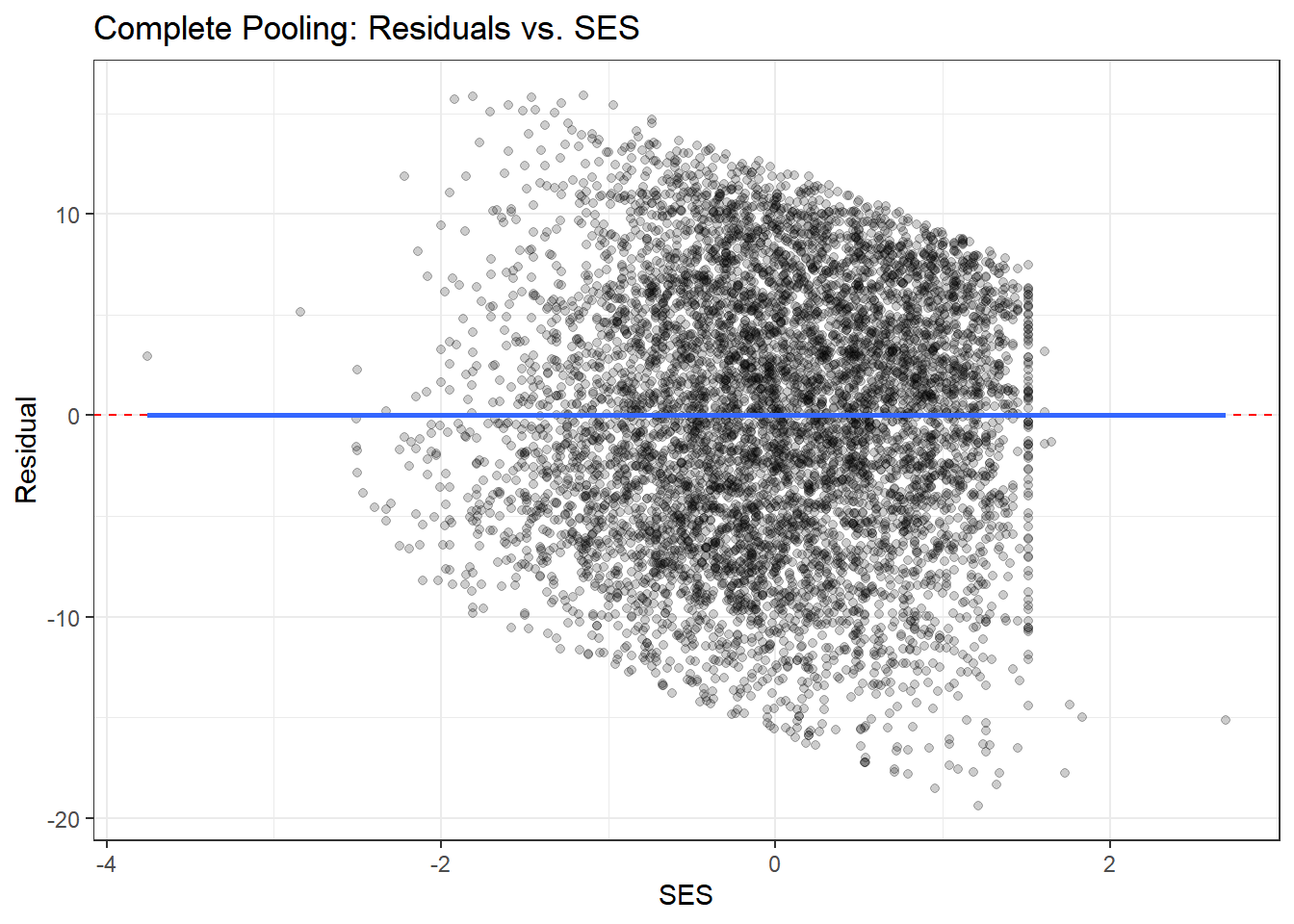
ggplot(residual_df, aes(x = ses, y = resid_partial)) +
  geom_point(alpha = 0.2) +
  geom_hline(yintercept = 0, color = "red", linetype = "dashed") +
  geom_smooth(se = FALSE) +
  theme_bw() +
  labs(title = "Partial Pooling: Residuals vs. SES",
       x = "SES", y = "Residual")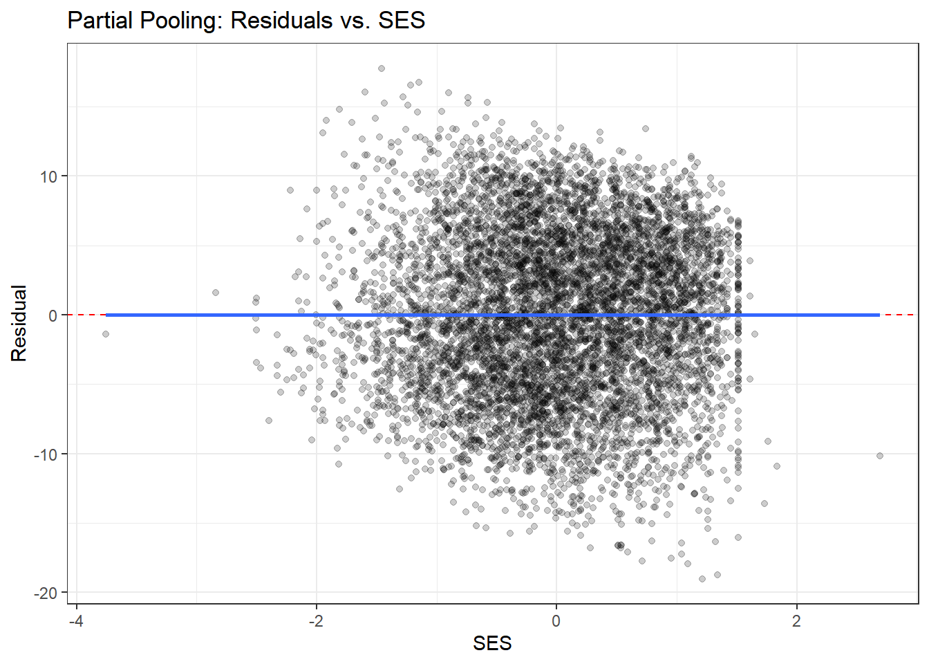
# Plot residuals by school (for a subset)
residual_df %>%
  filter(schoolid %in% sample_schools) %>%
  ggplot(aes(x = ses, y = resid_complete, color = schoolid)) +
  geom_point(alpha = 0.5) +
  geom_hline(yintercept = 0, linetype = "dashed") +
  facet_wrap(~ schoolid) +
  theme_bw() +
  theme(legend.position = "none") +
  labs(title = "Complete Pooling: Residuals by School",
       x = "SES", y = "Residual")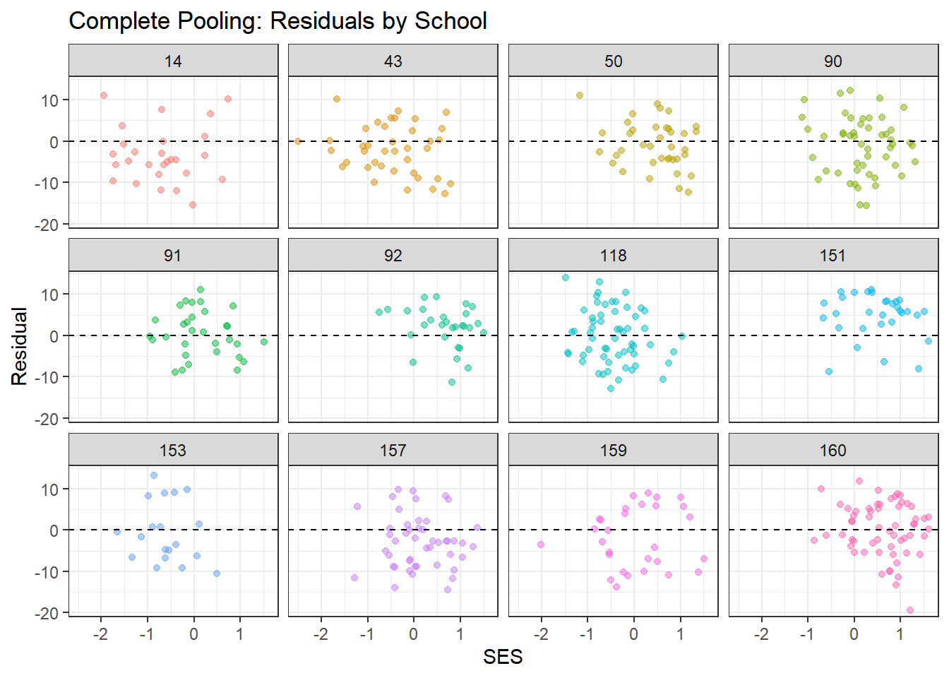
residual_df %>%
  filter(schoolid %in% sample_schools) %>%
  ggplot(aes(x = ses, y = resid_partial, color = schoolid)) +
  geom_point(alpha = 0.5) +
  geom_hline(yintercept = 0, linetype = "dashed") +
  facet_wrap(~ schoolid) +
  theme_bw() +
  theme(legend.position = "none") +
  labs(title = "Partial Pooling: Residuals by School",
       x = "SES", y = "Residual")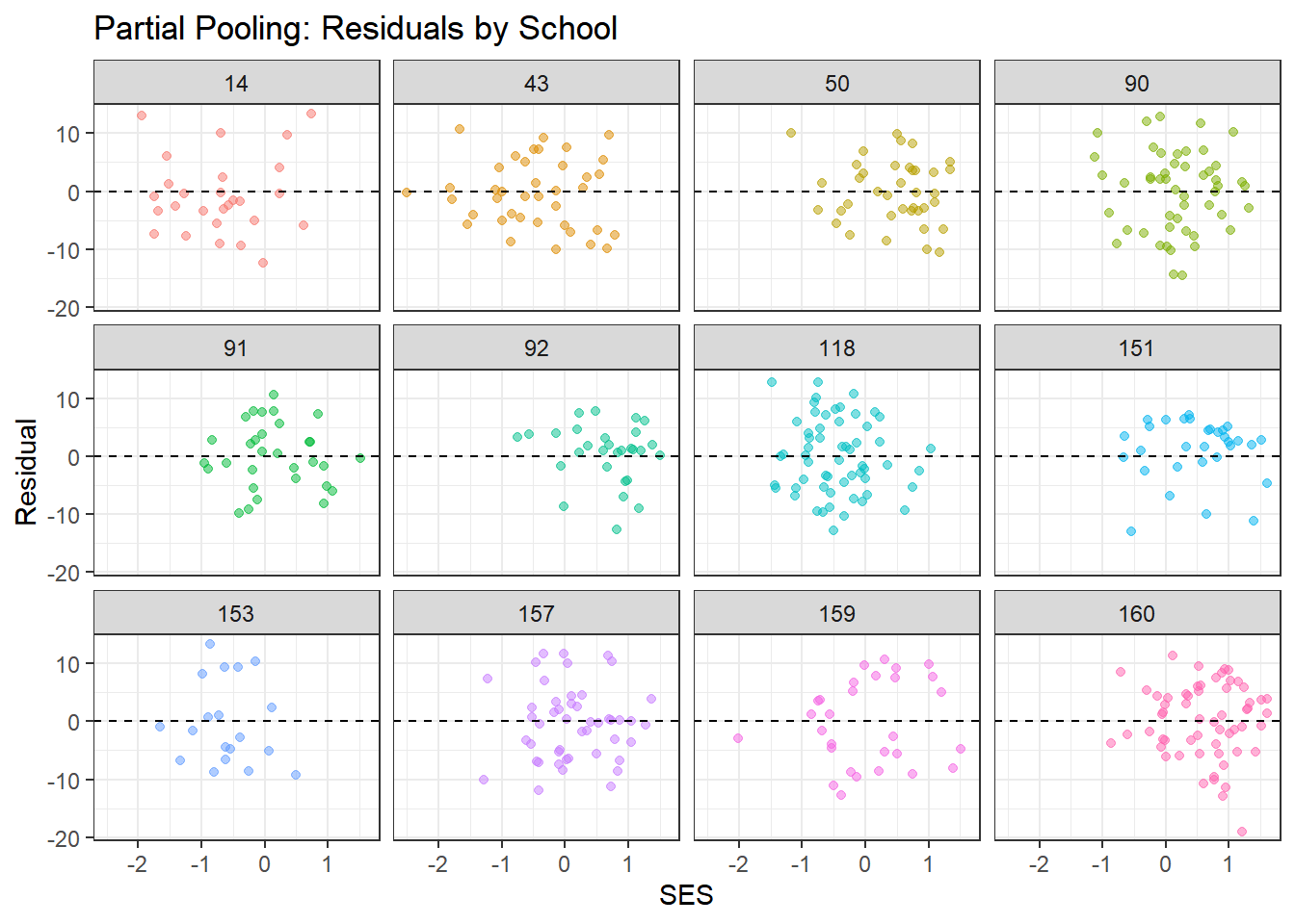
What to look for:
- Residuals should scatter randomly around zero with no clear patterns
- Complete pooling may show systematic patterns within schools (since it ignores school structure)
- Partial pooling should show more random scatter, indicating better fit to school-specific patterns
- The smoothed line (from geom_smooth) should be approximately flat
4.8.2 Summary of Posterior Predictive Checks
# Compute proportion of observations within 95% posterior predictive interval
in_interval <- function(y_obs, y_rep) {
  lower <- apply(y_rep, 2, quantile, probs = 0.025)
  upper <- apply(y_rep, 2, quantile, probs = 0.975)
  mean(y_obs >= lower & y_obs <= upper)
}

coverage_complete <- in_interval(y_obs, y_rep_complete)
coverage_no_pool <- in_interval(y_obs, y_rep_no_pool)
coverage_partial <- in_interval(y_obs, y_rep_partial)

cat("Proportion of observations within 95% posterior predictive interval:\n")
## Proportion of observations within 95% posterior predictive interval:## Complete Pooling: 0.968## No Pooling: 0.97## Partial Pooling: 0.969##
## Ideal coverage: 0.95If our model is well-calibrated, approximately 95% of observations should fall within the 95% posterior predictive interval. Values close to 0.95 indicate good calibration.
4.9 Interpreting the Hierarchical Model Results
Let’s extract and interpret the key findings from our best model (partial pooling).
# Extract hyperparameter estimates
hyper_summary <- summary(partial_pooling_fit,
                         pars = c("mu_beta_0", "mu_beta_1",
                                  "tau_beta_0", "tau_beta_1", "sigma"))$summary

print(hyper_summary)
## mean se_mean sd 2.5% 25% 50%
## mu_beta_0 12.6483104 0.0028399611 0.18932611 12.2702981 12.5190738 12.6498666
## mu_beta_1 2.3950659 0.0041013095 0.12257698 2.1603412 2.3108903 2.3921695
## tau_beta_0 2.2137904 0.0029497344 0.15403334 1.9239519 2.1051926 2.2084379
## tau_beta_1 0.6078147 0.0181116601 0.19025983 0.2489274 0.4744331 0.6065262
## sigma 6.0703166 0.0007929519 0.05073029 5.9686599 6.0367220 6.0704066
## 75% 97.5% n_eff Rhat
## mu_beta_0 12.7724577 13.0222783 4444.2268 1.000147
## mu_beta_1 2.4776081 2.6322453 893.2494 1.003253
## tau_beta_0 2.3100283 2.5271185 2726.8651 1.000546
## tau_beta_1 0.7427003 0.9788615 110.3514 1.020983
## sigma 6.1050898 6.1687899 4092.9932 1.000403# Extract and visualize school-specific effects
beta_0_summary <- summary(partial_pooling_fit, pars = "beta_0")$summary
beta_1_summary <- summary(partial_pooling_fit, pars = "beta_1")$summary
# Create dataframe for visualization
school_effects <- data.frame(
school = 1:nrow(beta_0_summary),
intercept = beta_0_summary[, "mean"],
intercept_lower = beta_0_summary[, "2.5%"],
intercept_upper = beta_0_summary[, "97.5%"],
slope = beta_1_summary[, "mean"],
slope_lower = beta_1_summary[, "2.5%"],
slope_upper = beta_1_summary[, "97.5%"],
n_students = school_counts$n_students
)4.9.1 Visualizing School-Specific Effects
4.9.1.1 Distribution of School Intercepts
ggplot(school_effects, aes(x = intercept)) +
  geom_histogram(bins = 30, fill = "steelblue", alpha = 0.7) +
  geom_vline(xintercept = hyper_summary["mu_beta_0", "mean"],
             color = "red", linetype = "dashed", size = 1) +
  theme_bw() +
  labs(title = "Distribution of School-Specific Intercepts",
       subtitle = "Red line shows population mean",
       x = "School Intercept (Baseline Achievement)",
       y = "Count")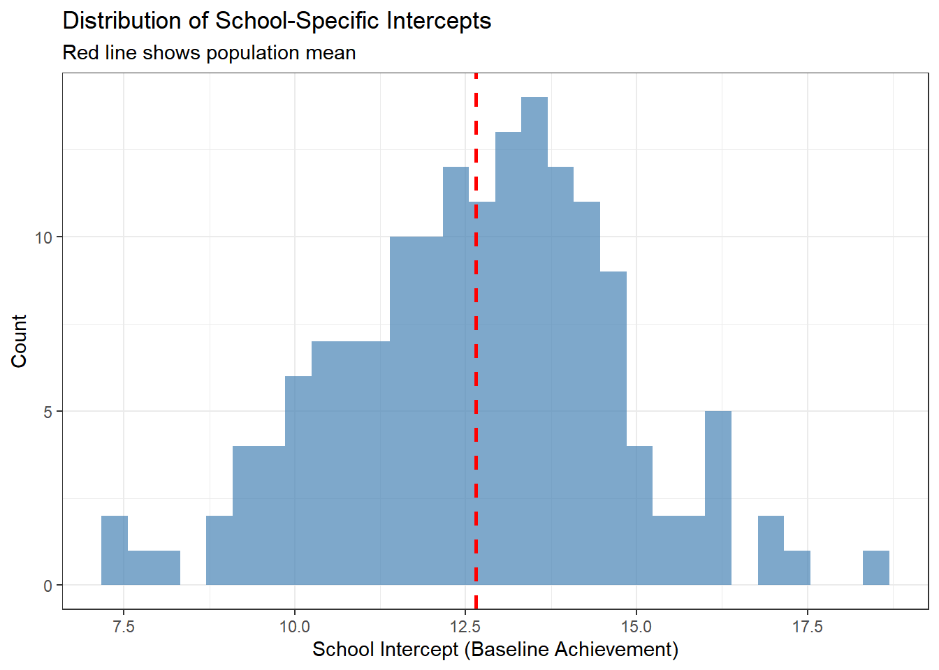
This histogram shows the variation in baseline achievement across schools. The red line indicates the average school. Schools to the right have higher baseline achievement; schools to the left have lower achievement.
4.9.1.2 Distribution of School Slopes
ggplot(school_effects, aes(x = slope)) +
  geom_histogram(bins = 30, fill = "darkgreen", alpha = 0.7) +
  geom_vline(xintercept = hyper_summary["mu_beta_1", "mean"],
             color = "red", linetype = "dashed", size = 1) +
  theme_bw() +
  labs(title = "Distribution of School-Specific SES Effects",
       subtitle = "Red line shows population mean",
       x = "School Slope (SES Effect)",
       y = "Count")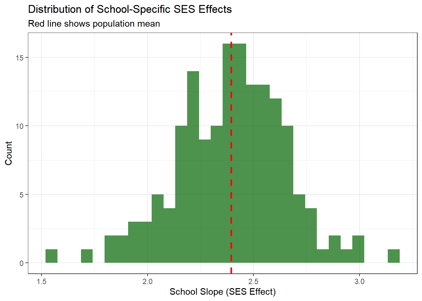
This shows how the relationship between SES and achievement varies across schools. Most schools show a positive relationship (positive slopes), but the strength varies.
4.9.1.3 Caterpillar Plot: Intercepts
A caterpillar plot shows point estimates and uncertainty intervals, sorted by magnitude.
school_effects %>%
  arrange(intercept) %>%
  mutate(school_rank = row_number()) %>%
  ggplot(aes(x = school_rank, y = intercept)) +
  geom_pointrange(aes(ymin = intercept_lower, ymax = intercept_upper),
                  size = 0.3, alpha = 0.6) +
  geom_hline(yintercept = hyper_summary["mu_beta_0", "mean"],
             color = "red", linetype = "dashed") +
  theme_bw() +
  labs(title = "School-Specific Intercepts with 95% Credible Intervals",
       x = "School (Ranked by Intercept)",
       y = "Intercept")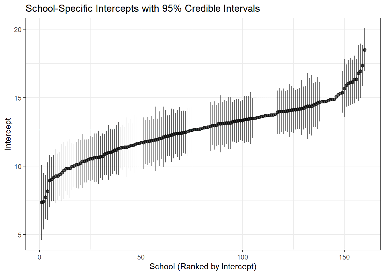
Interpretation:
- Each point is a school’s estimated baseline achievement
- Error bars show 95% credible intervals
- Schools with wider intervals have more uncertainty (typically smaller schools)
- The red line shows the population mean—notice how schools cluster around it
4.10 Key Takeaways
4.10.1 When to Use Each Approach
| Model | When to Use | Advantages | Disadvantages |
|---|---|---|---|
| Complete Pooling | Groups are truly identical; no meaningful group structure | Simple; maximum power | Ignores heterogeneity; biased if groups differ |
| No Pooling | Groups are independent; large samples in each group; only care about specific groups | Flexible; no assumptions about similarity | Overfitting; unstable for small groups; no generalization |
| Partial Pooling | Groups are related but different; variable group sizes; want to generalize | Optimal bias-variance tradeoff; borrows strength; generalizes | More complex; requires more computation |
4.10.2 Benefits of Hierarchical Models
- Better estimates for small groups: Regularization through partial pooling
- Quantifies variation: Explicit estimates of between-group and within-group variation
- Population-level inference: Can make statements about “schools in general”
- Predictions for new groups: Can predict outcomes for schools not in the dataset
- Handles unbalanced data: Automatically accounts for different group sizes
- Interpretable structure: Separates group-level and individual-level effects
4.10.3 Model Checking Workflow
For any Bayesian analysis, follow this workflow:
- Fit the model: Specify priors, likelihood, and hierarchical structure
- Check convergence: Examine trace plots, R-hat, effective sample size
- Posterior predictive checks: Visually assess whether simulated data resembles observed data
- Model comparison: Use LOO-CV or WAIC to compare competing models
- Interpret results: Extract and visualize key parameters
- Sensitivity analysis: Check whether results are sensitive to prior choices (not shown here, but important!)
4.11 Extensions and Further Reading
This tutorial covered the basics of hierarchical modeling with varying intercepts and slopes. Natural extensions include:
- More levels: Students within classrooms within schools within districts
- Cross-classified structures: Students nested in both neighborhoods and schools
- Non-linear effects: Using splines or polynomials for predictors
- Non-normal outcomes: Logistic regression for binary outcomes, Poisson for counts
- Correlation between random effects: Allowing intercepts and slopes to correlate within groups
- Time-varying effects: Longitudinal models with repeated measures
4.11.1 Recommended Resources
- Gelman & Hill (2007): Data Analysis Using Regression and Multilevel/Hierarchical Models - The definitive textbook
- McElreath (2020): Statistical Rethinking - Excellent introduction to Bayesian modeling
- Stan User’s Guide: Comprehensive documentation and case studies at mc-stan.org
- Bürkner (2017): The
brmspackage provides a more user-friendly interface to Stan for standard models
4.12 Conclusion
Hierarchical models represent a principled approach to analyzing grouped data, offering a middle ground between treating groups as identical (complete pooling) and treating them as completely unrelated (no pooling). Through partial pooling, these models borrow strength across groups, leading to more accurate and stable estimates, especially for groups with limited data.
Stan provides the computational tools to fit these complex models efficiently, making sophisticated Bayesian analyses practical for real-world data. Combined with proper model checking and comparison, hierarchical models are an essential tool for modern data analysis in the social sciences, public health, and beyond.
The key insight is that groups are neither identical nor completely unique—hierarchical models capture this reality elegantly and allow us to learn about both specific groups and the population as a whole to look for: - Trace plots:** Should look like “hairy caterpillars”—chains should mix well and be stationary - R-hat values: Should be very close to 1.00 (< 1.01 is good) - Effective sample size (n_eff): Should be reasonably large (> 400 per chain is good) - Pairs plots: Check for strong correlations that might indicate identification problems
The complete pooling model should converge easily since it’s the simplest specification.